


Vocab
Ryan Hellyer Williamson
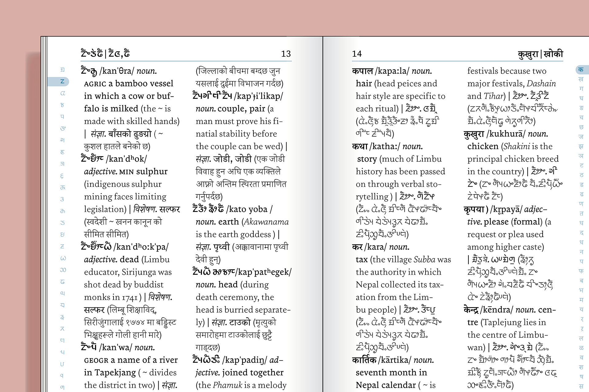
Vocab is a trilingual work horse intended to set messy, complex and etymologic typography.
At the user level: The type family supports the Latin,
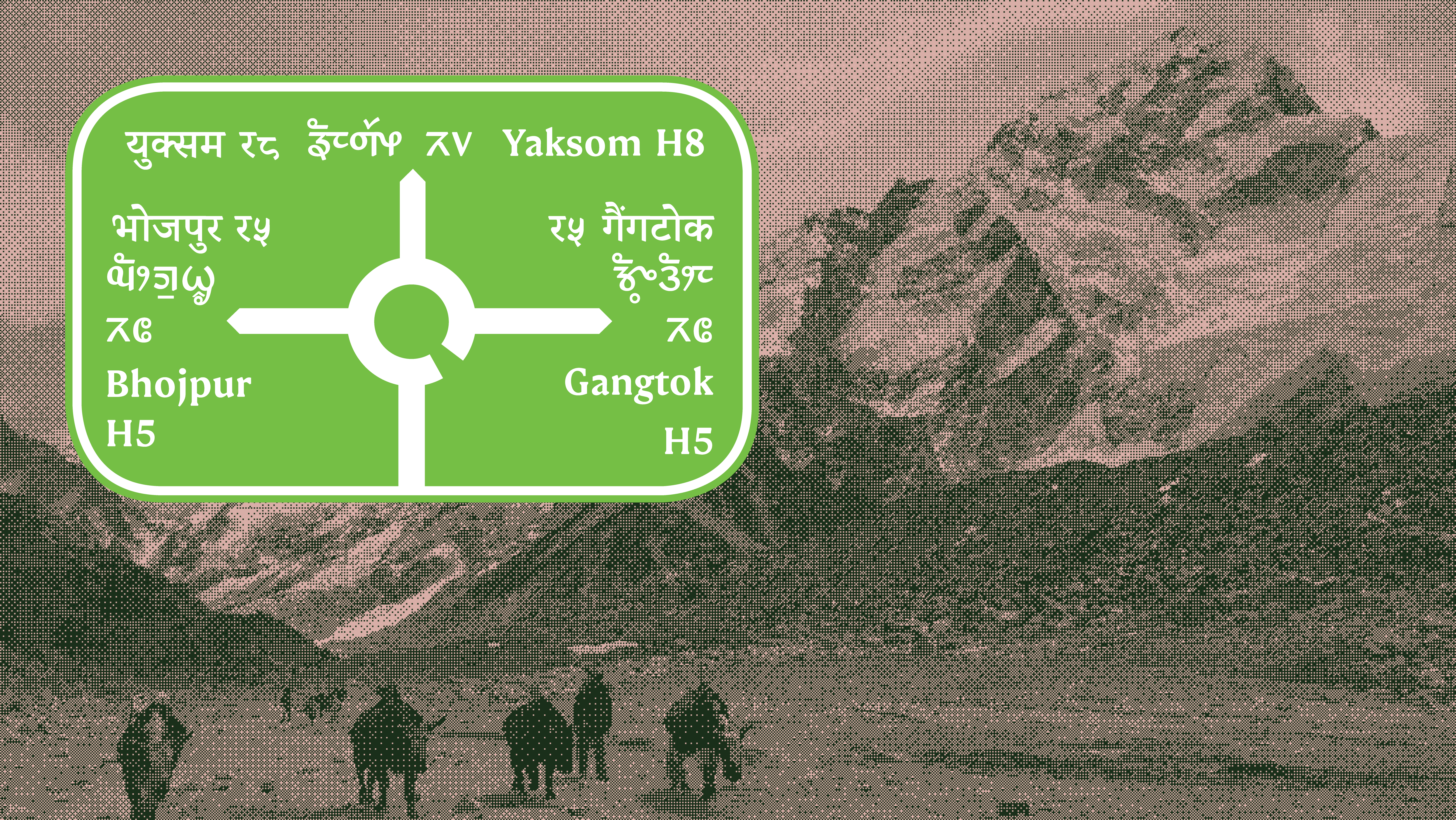
Devanagari and Sirijunga (Limbu) scripts. There are three
weights for the three script, each with a primary upright
style for text and a secondary style for emphasis. The three
scripts have been designed to work together within the
same document without compromising on the individual
script’s natural proportions. Additionally, Vocab covers the
International Phonetic Alphabet character set in three
weights to support its use in etymologic and linguistic
typography.
At the community level: The type family pairs the three scripts together to support the typographic needs of the Yakthung community who use the Sirijunga script. They are an indigenous community of Nepal and Sikkim, with a growing literacy culture and readership. The Sirijunga script is one neglected by conventional printing practices, actively repressed throughout history and only recently acknowledged by the nations that the community resides in. Vocab rediscovers orthographic behaviours lost in digital Sirijunga type, as well as draws on the wealth of unexplored typographic history to distil a secondary style. The Sirijunga addition to type family is supported by an in-depth research project into the development of the Sirijunga script, done in conjunction with the practical typeface project at Reading.


Ryan Hellyer Williamson
Ryan Hellyer Williamson is an Australian type designer,
born in Japan and now based in the UK. He first discovered
letters through legally questionable late night antics on
walls and train lines throughout Sydney. After reforming his
ways he studied and received his BA (Hons) in design from
the University of New South Wales, Sydney. Before moving
to the UK to study at Reading he headed the letterpress
production team at The Distillery, a branding and luxury
stationary agency based in Sydney, as well as freelanced as a
street artist.
Contact, chat and more at:
Instagram or Email
Q&A
Q: How did designing multiple scripts at the same time within one project influence your workflow and/or design thinking?
A: Coming into the Matd, I knew designing scripts I was
unfamiliar with would present a new and tough challenge. I
was initially reluctant to try anything besides Japanese (a
script I am very familiar with). However, throughout the
course I was reassured by teachers and industry
professionals that literacy in a language isn’t the definitive
criteria for creating proficient type in a script, but in fact an
understanding of the writing systems, its rules and history,
are more important. This ground up methodology is what I
applied when designing the three additional scripts in the
type family. In this respect, my future workflow for
designing in scripts, including latin, have been shaped by
the guidance, advice and my own discoveries throughout
the course.
Q: Aside from producing new typefaces, what are some other
ways in which you hope to contribute to type design and the
wider design community?
A: The Matd has provided me with a new perspective on
type design’s situation within the wider world. I now no
longer want to just draw beautiful curves (although I still
enjoy this and hope it is a small part of my future career),
but instead reimagine the growing technological possibilities
in type design. I hope to move past creating a beautiful
group of letters, and into realising abstract ideas in a usable
product, hopefully doing so in a way that can be articulated
and taught back into the type design community.
What is something you did (or you wish you had done/known) in preparation for the course that ended up being helpful during the development of the typeface?
A: After starting the course I quickly became intrigued and
invested in the Sirijunga writing system, a topic that would
later form the focus for both my dissertation and typeface.
In hind sight I feel that I may have been a bit hasty and put
up blinders for other topics I could have pursued. On the
other hand, this early start allowed me to amass a wealth of
knowledge on the writing system and ultimately benefited
my final outcomes. I guess what I wish is that I had prepared
myself better for the onslaught of learning and considered it
all, rather than investing myself in an early discovery.
Colophon
And that’s a wrap! It’s been a pleasure to share the MATD19/20 final projects with you. We would like to send a big thank you to everyone who made this possible: Gerry, Fiona, Fred, Victor, Ewan, Borna, Vaibhav, Cheng, Bianca, Laurence, Frank and all the other lecturers for their time and feedback. Shoutout to coop, Park House, the coffee machine and the farmer’s market.
Typeface: Ohno Type’s Degular.
Team
Branding
John Mawby
Adriana Pérez Conesa
José Carratala
Jeremy Johnson
Content
Michaela Staton
Geneviève Cugnart
Development
Simon Thiefes
Eric Karnes
Radek Łukasiewicz
Team
PM
Keya Vadgama
Simon Thiefes
UI/UX
Keya Vadgama
Mark Zhu
Ryan Williamson