Practicum
Eric Karnes
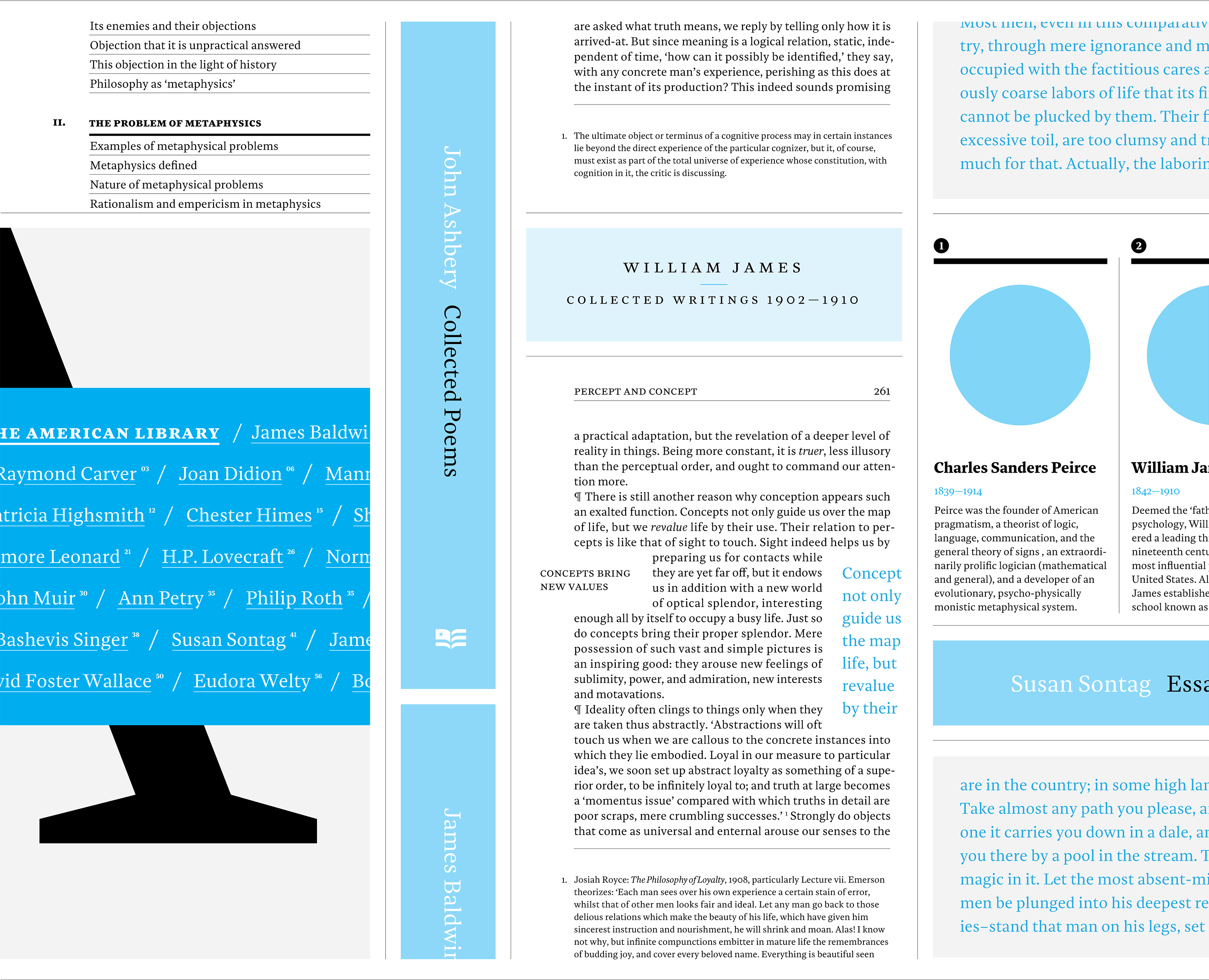
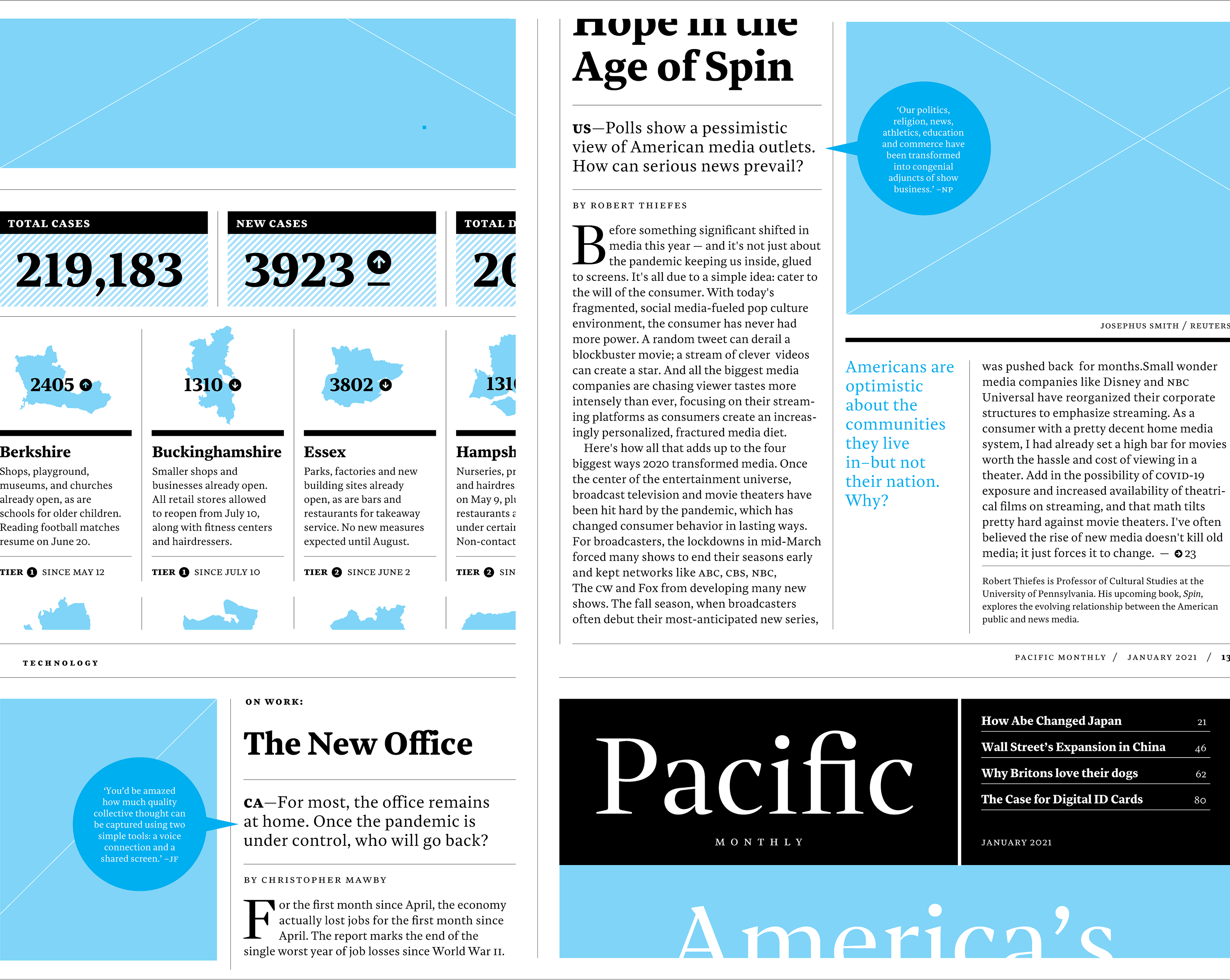
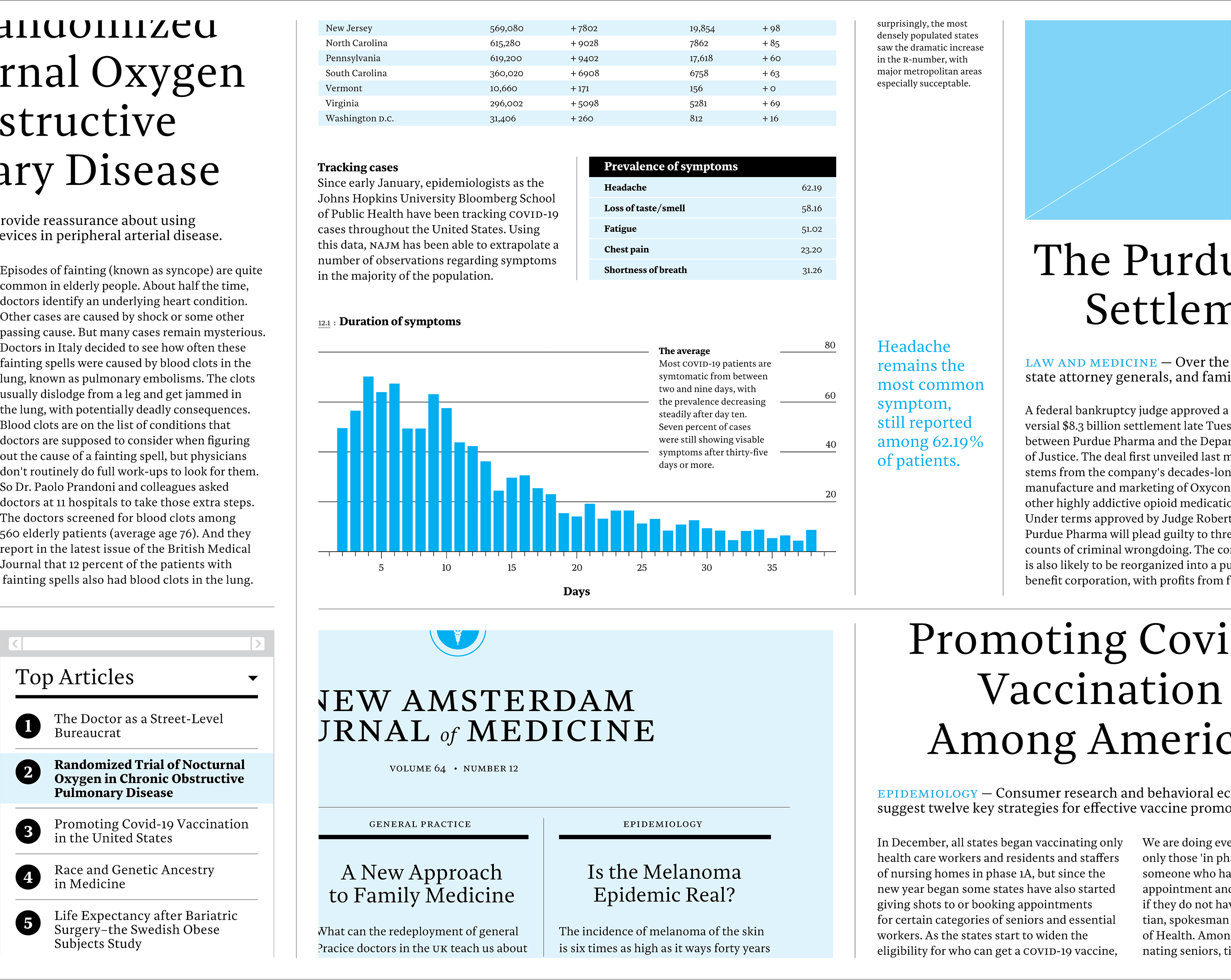
Practicum a no-nonsense serif workhorse designed for complex text settings. It aims to be unassuming and easily readable at text sizes, yet sophisticated and contemporary when set larger. Originally conceived of as a news typeface for print and screen, it has since grown in its scope of application to encompass any serious content–from long-form journalism and professional journals to literature and cultural publications.


Eric Karnes
Eric a graphic desiger and educator. Studying at University of Reading was part of a possible mid-career shift into typeface design. He hopes to continue improving his skills and eventually produce a few commercial typefaces on occasion.
Website
Q&A
Q: Were you inspired by any particular writing tool or typographic style?
A: From the beginning, I was interested in producing an unobtrusive serif workhorse. Existing typefaces designed specifically for newspapers made up the bulk of my initial research. Not surprisingly, Monotype’s Times became perhaps the most direct source of inspiration (though Practical is not a revival). Times (and its descendants) were a typographic genre to which I had paid scant attention. As a young design student, I was strongly advised to steer clear of the readily available digital versions. Going back to original source material, however, I admired the Monotype version’s quiet authority. Its use subtly signaled that ‘this information is important.’ I’ve attempted to capture this elusive feature in my own design.
Q: Aside from producing new typefaces, what are some other ways in which you hope to contribute to type design and the wider design community?
A: One of the surprising outcomes from my time at Reading has been the joy I found in pursuing historical research. I was perhaps unusual in thoroughly enjoying (most of) the dissertation process. I’d like to start researching and writing articles on typographic history–something I wouldn't have expected to hear myself say a year ago.
Q: What is something you wish you had done in preparation for the course that could have helped the development of your typeface?
A: More independent study in hand-lettering and calligraphy. A criticism I still have of Practicum is its stiffness, which I believe comes from my inexperience with calligraphic letterforms. I hope I overcame this a bit with the Arabic, which was informed by countless experiments writing each character with a pen and ink.
Colophon
And that’s a wrap! It’s been a pleasure to share the MATD19/20 final projects with you. We would like to send a big thank you to everyone who made this possible: Gerry, Fiona, Fred, Victor, Ewan, Borna, Vaibhav, Cheng, Bianca, Laurence, Frank and all the other lecturers for their time and feedback. Shoutout to coop, Park House, the coffee machine and the farmer’s market.
Typeface: Ohno Type’s Degular.
Team
Branding
John Mawby
Adriana Pérez Conesa
José Carratala
Jeremy Johnson
Content
Michaela Staton
Geneviève Cugnart
Development
Simon Thiefes
Eric Karnes
Radek Łukasiewicz
Team
PM
Keya Vadgama
Simon Thiefes
UI/UX
Keya Vadgama
Mark Zhu
Ryan Williamson