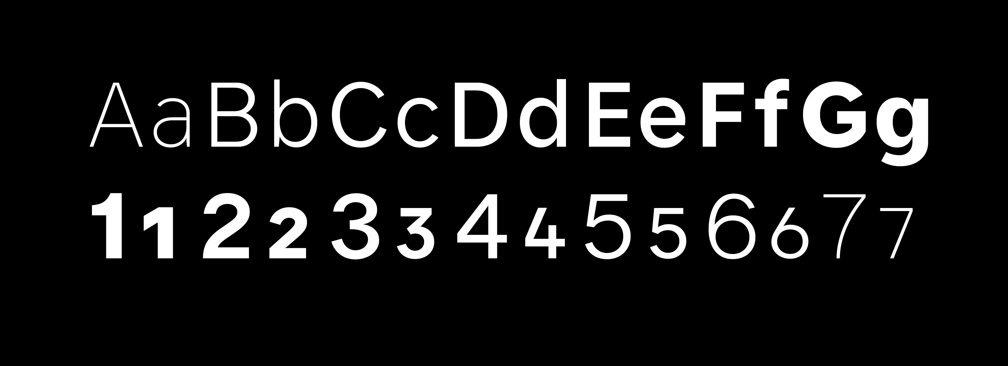
Forme Grotesque
Jeremy Johnson
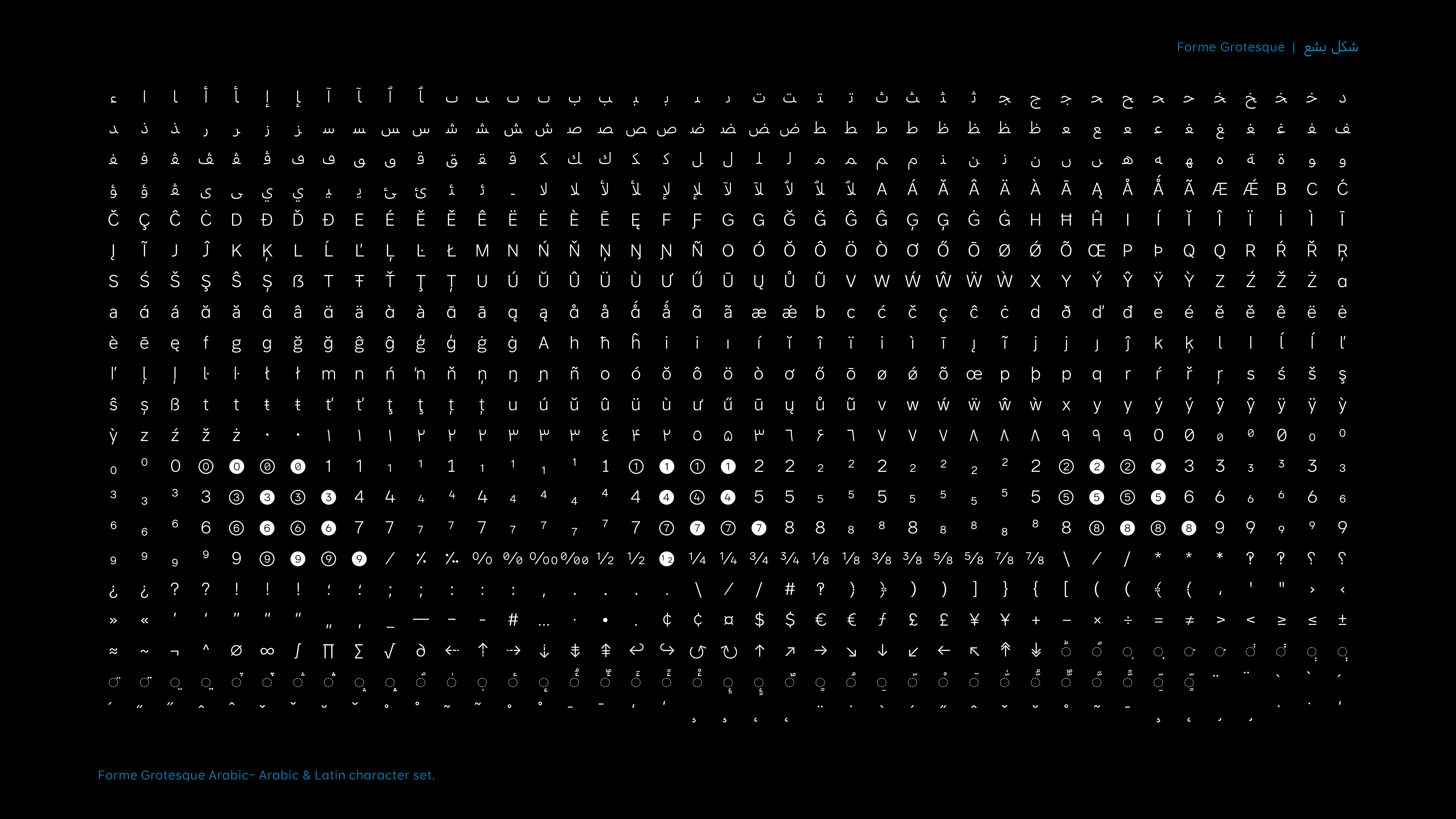
Forme Grotesque is multi purpose variable font with weight, slanted and a micro axis, conceived for both print & screen use. The design of the glyphs are simple and straight forward, with large proportions and generous spacing. An extended character set allowʼs for alternate numbers, simplified currency symbols and alternative punctuation. The script coverage is extended Latin and Arabic. Family options, include light to bold with two display weights at either ends of the spectrum, an extra light and a black weight, and extraʼs that contain, emojiʼs, arrowʼs and circled figures.
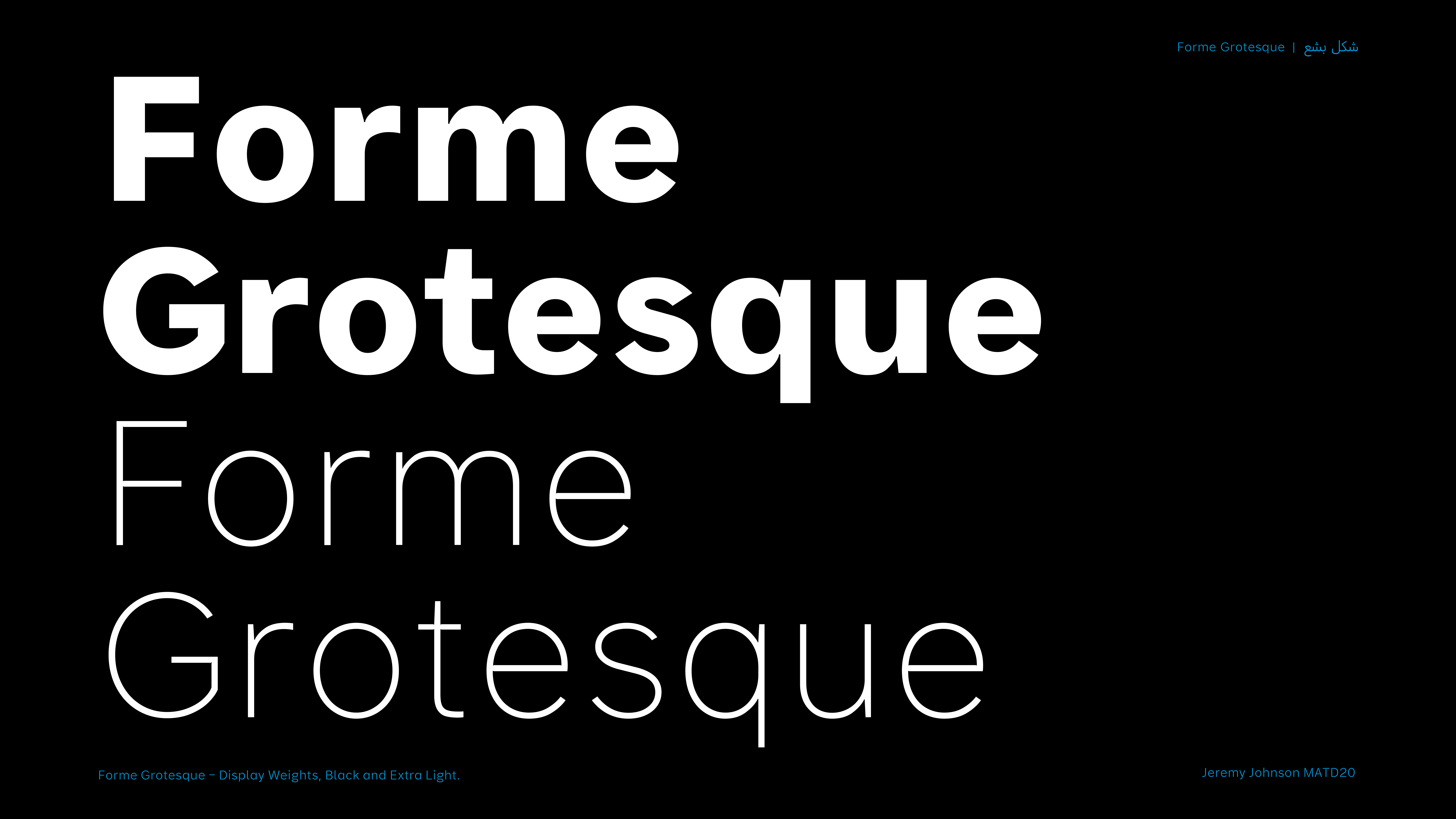
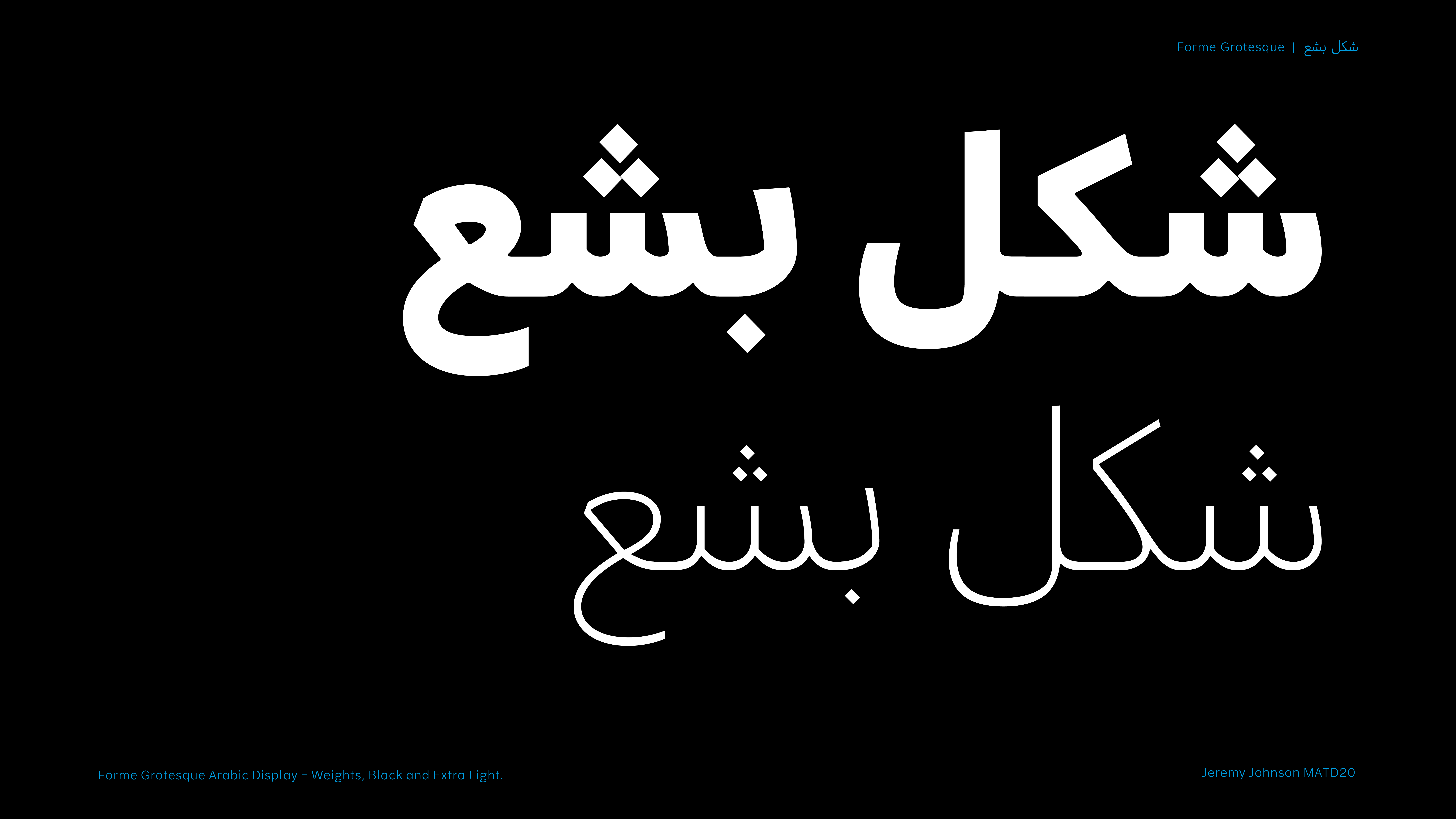
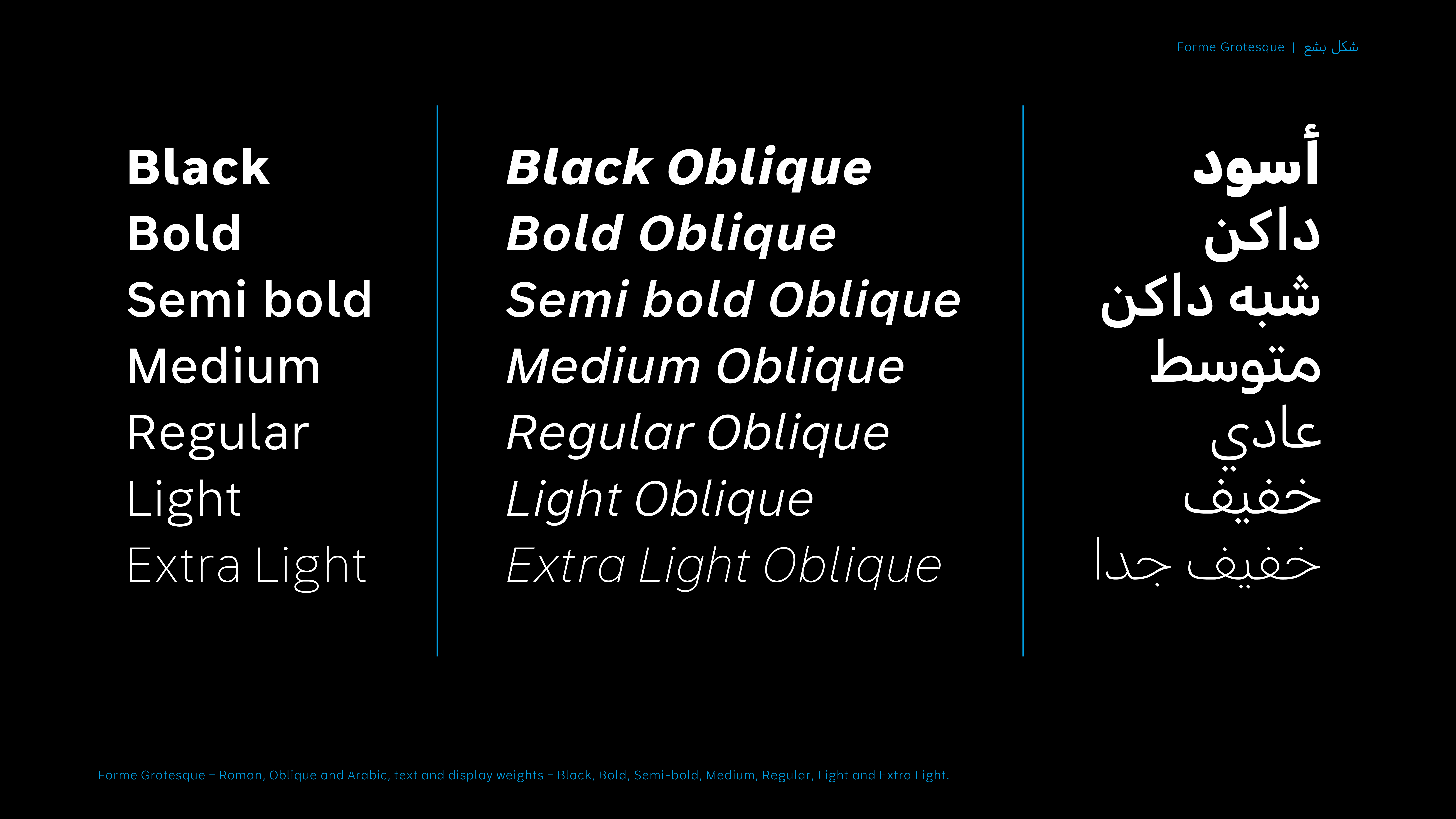
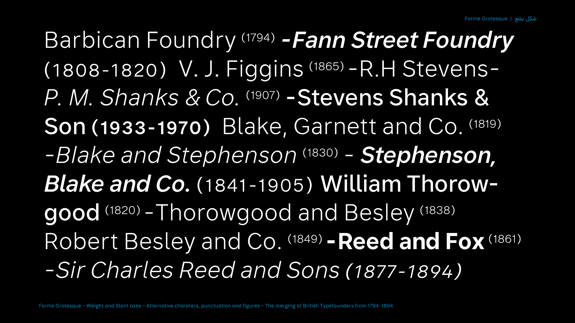
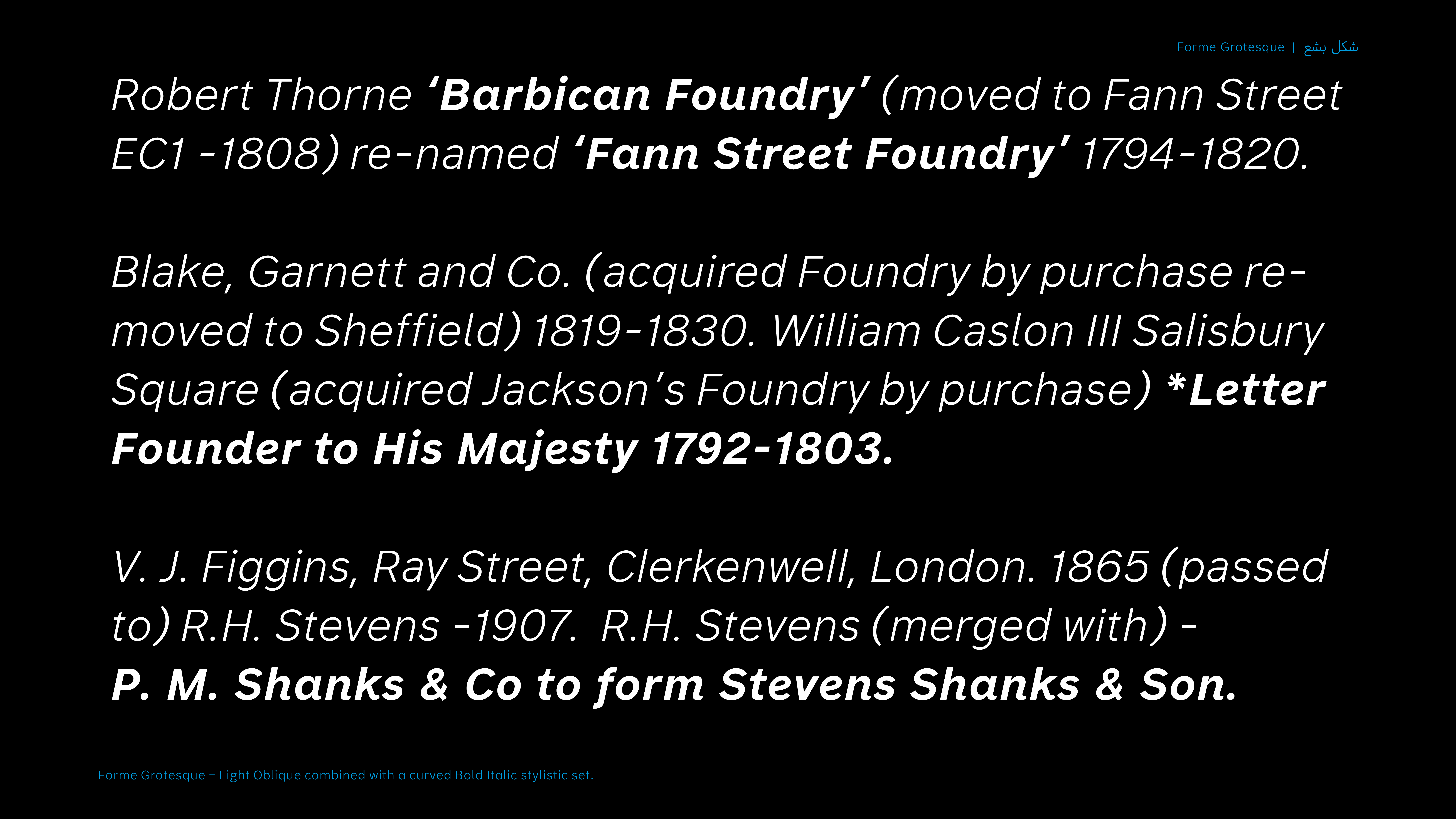
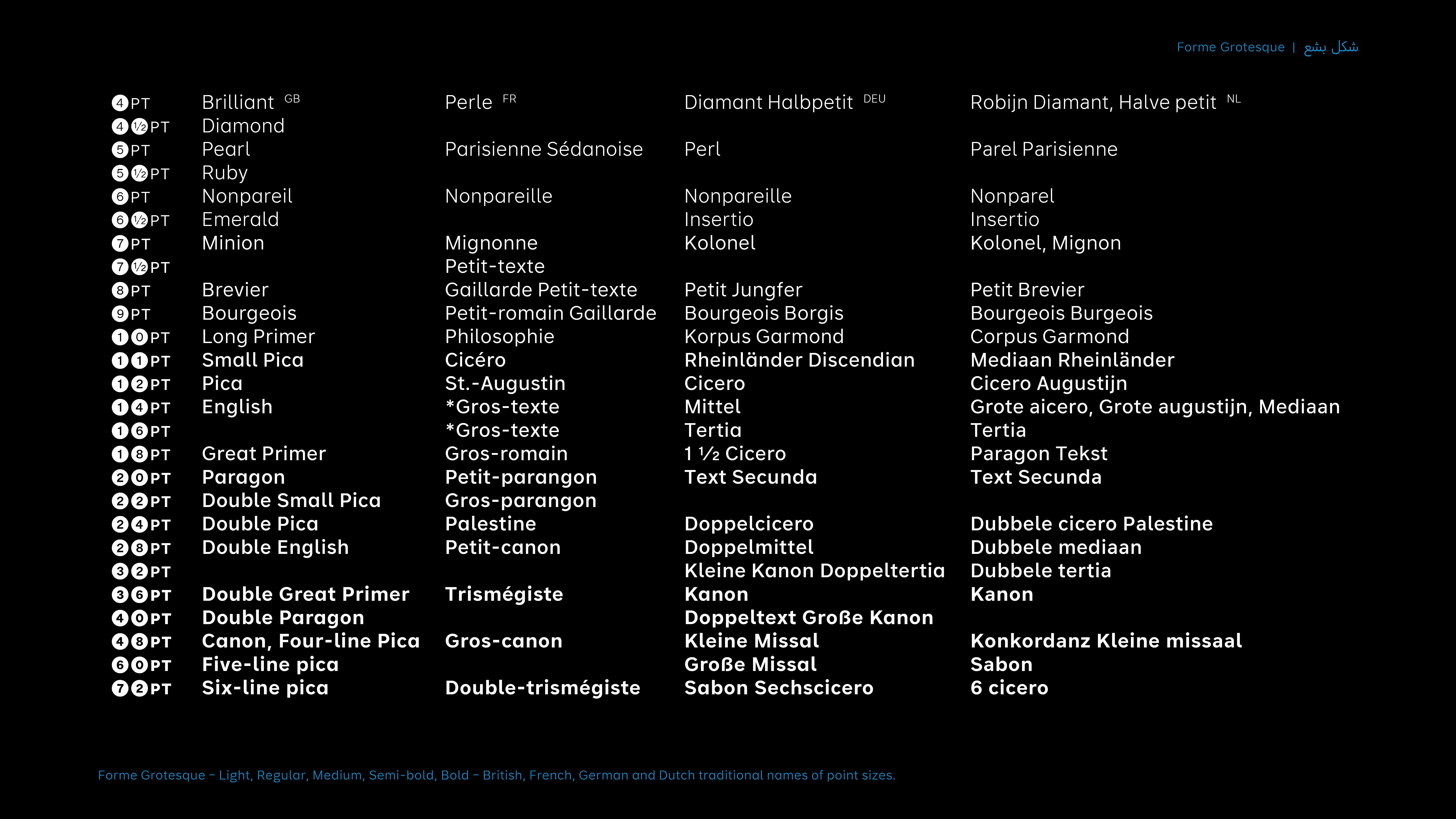
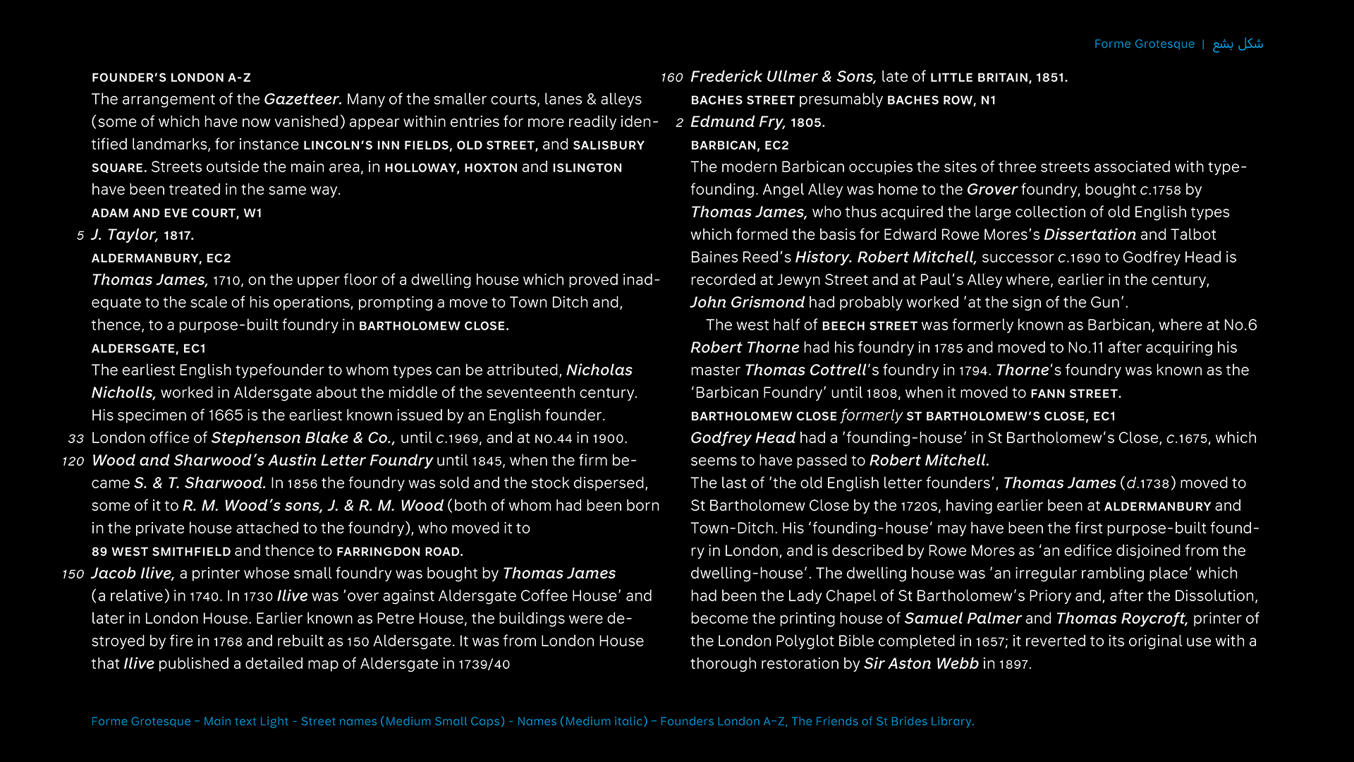
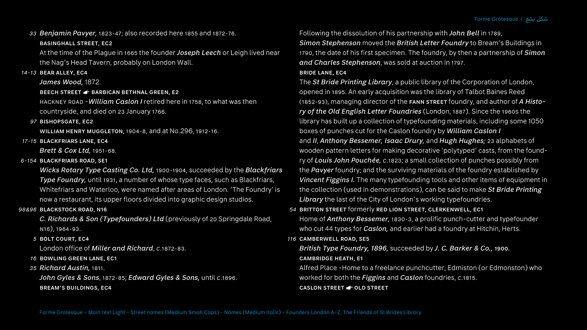
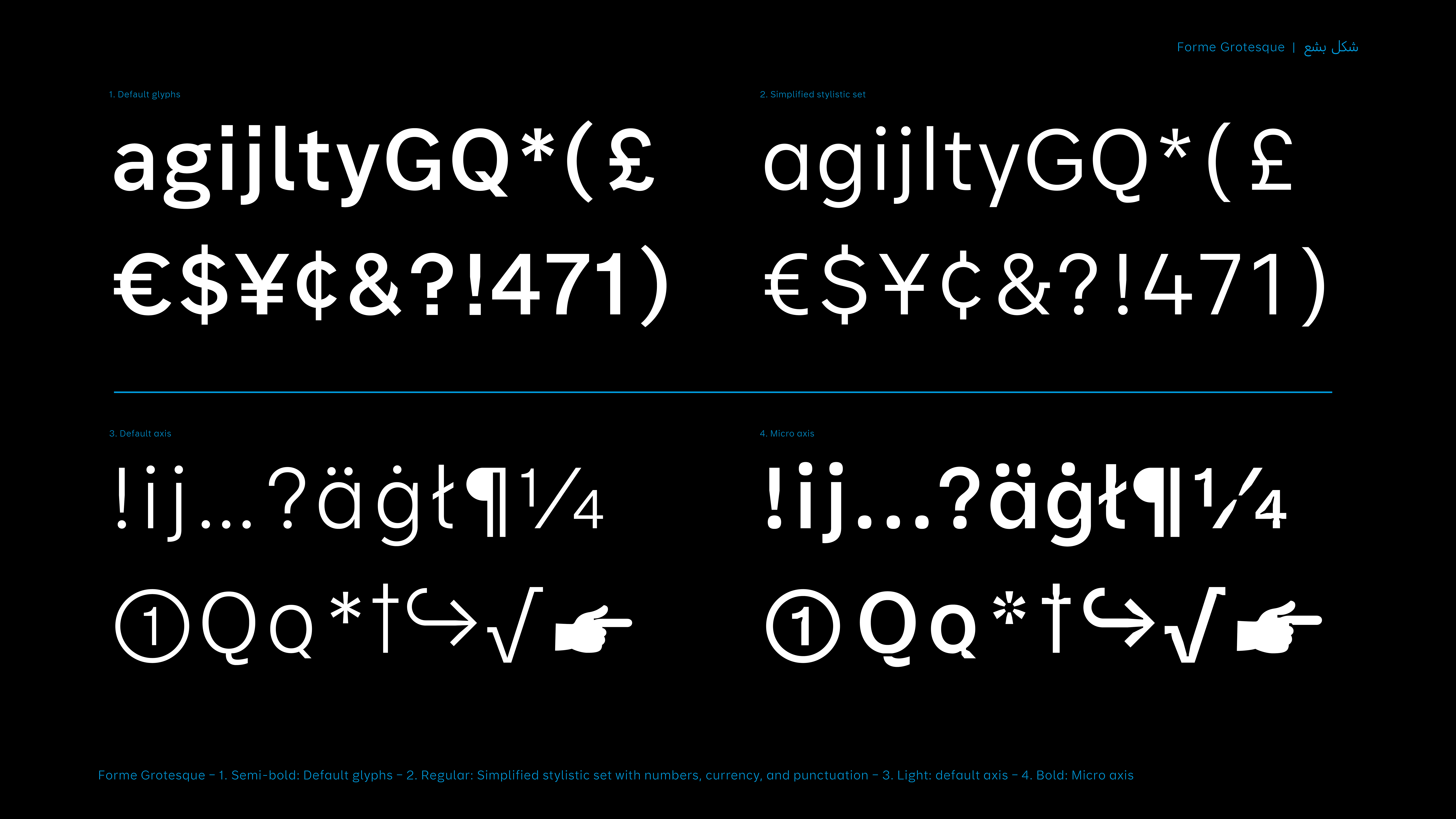
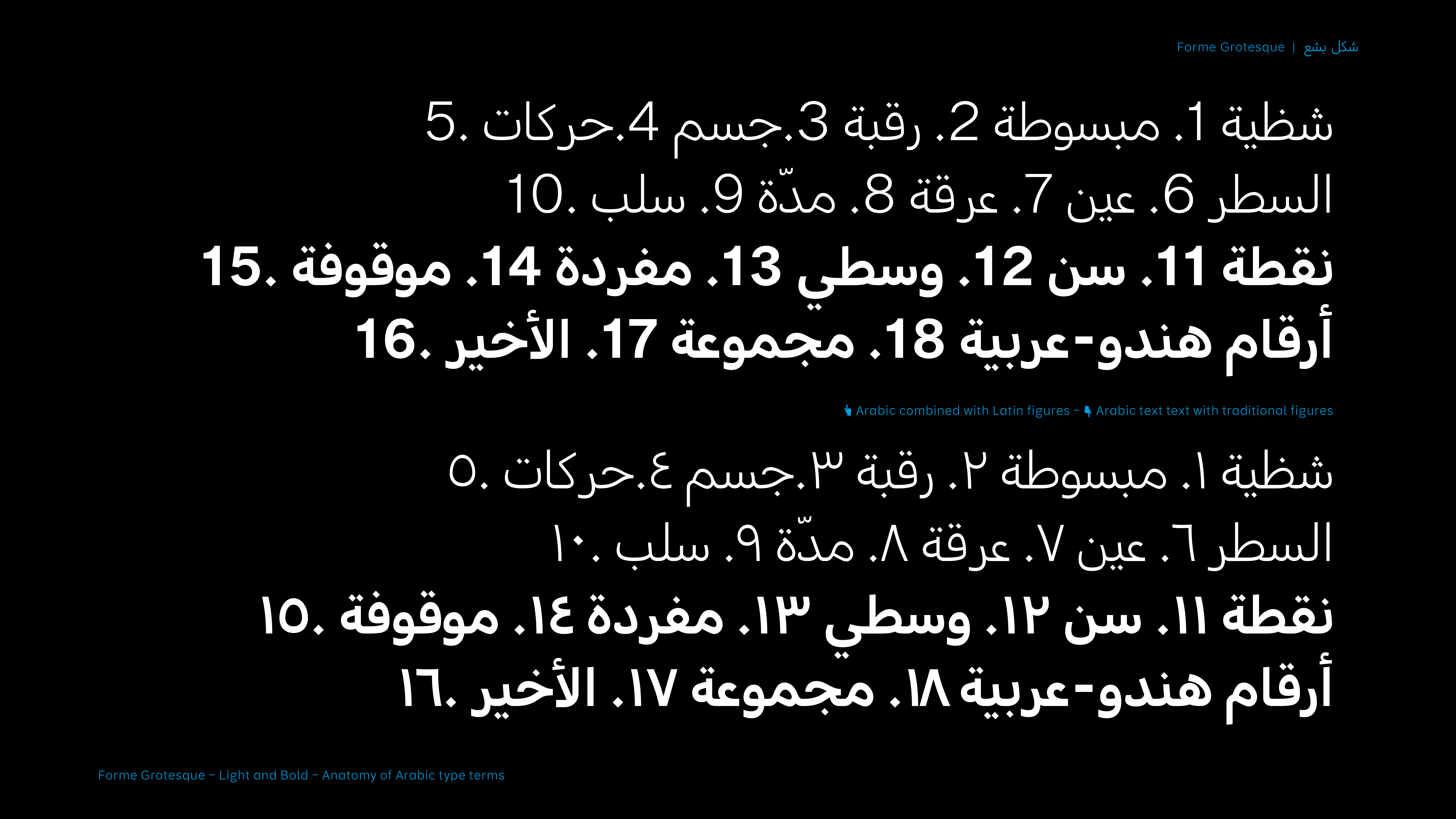
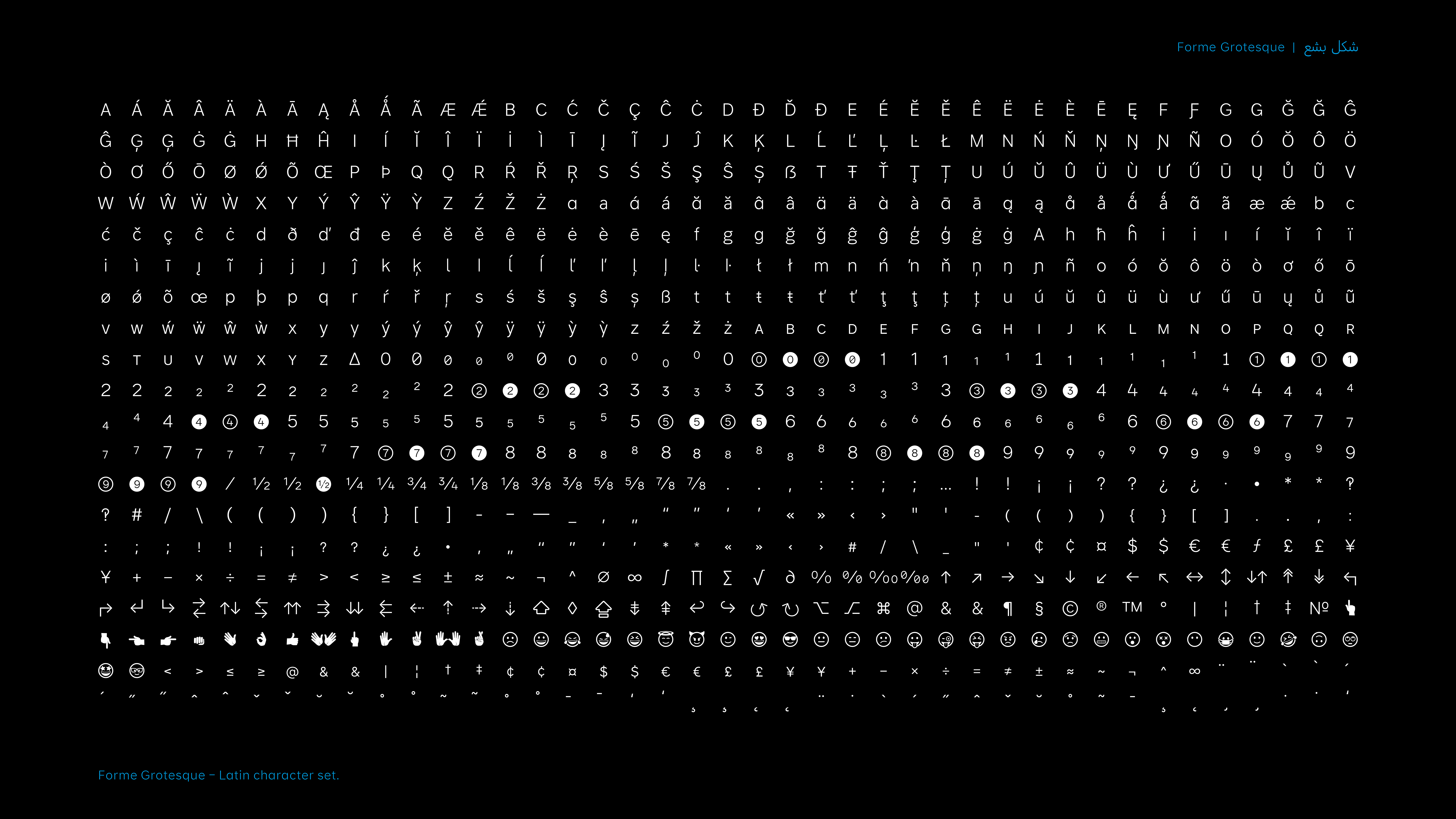
Variable font playground
Jeremy Johnson
Jeremy Johnson is a typeface and graphic designer from the UK. Before graduating from the University of Reading, he studied communications at the Royal College of Art, being taught by Margaret Calvert, and Alan Kitching. He worked at the Typography workshop in London, which sparked a keen interest in Letterpress and type design.
Email
Instagram
Q&A
Q: How did designing multiple scripts at the same within one project influence your workflow and/or design thinking?
A: The Arabic script had to be as simple as possible to fit with the Latin, but still retain some contrast and a fluid shape.
Q: What is something you did (or you wish you had done/known) in preparation for the course that ended up being helpful during the development of the typeface?
A: In hindsight it would have been benifitial to have started the reading for my dissertation earlier.
Q: Aside from producing new typefaces, what are some other ways in which you hope to contribute to type design and the wider design community?
A: Getting a job?
Q: Were you inspired by any particular writing tool or typographic style?
A: Telephone directory type, in particular the work of Ladislas Mandel, Josephus Carratalá, Radek Łukasiewicz, Nebiolo foundry, and articles on Cast.
Colophon
And that’s a wrap! It’s been a pleasure to share the MATD19/20 final projects with you. We would like to send a big thank you to everyone who made this possible: Gerry, Fiona, Fred, Victor, Ewan, Borna, Vaibhav, Cheng, Bianca, Laurence, Frank and all the other lecturers for their time and feedback. Shoutout to coop, Park House, the coffee machine and the farmer’s market.
Typeface: Ohno Type’s Degular.
Team
Branding
John Mawby
Adriana Pérez Conesa
José Carratala
Jeremy Johnson
Content
Michaela Staton
Geneviève Cugnart
Development
Simon Thiefes
Eric Karnes
Radek Łukasiewicz
Team
PM
Keya Vadgama
Simon Thiefes
UI/UX
Keya Vadgama
Mark Zhu
Ryan Williamson