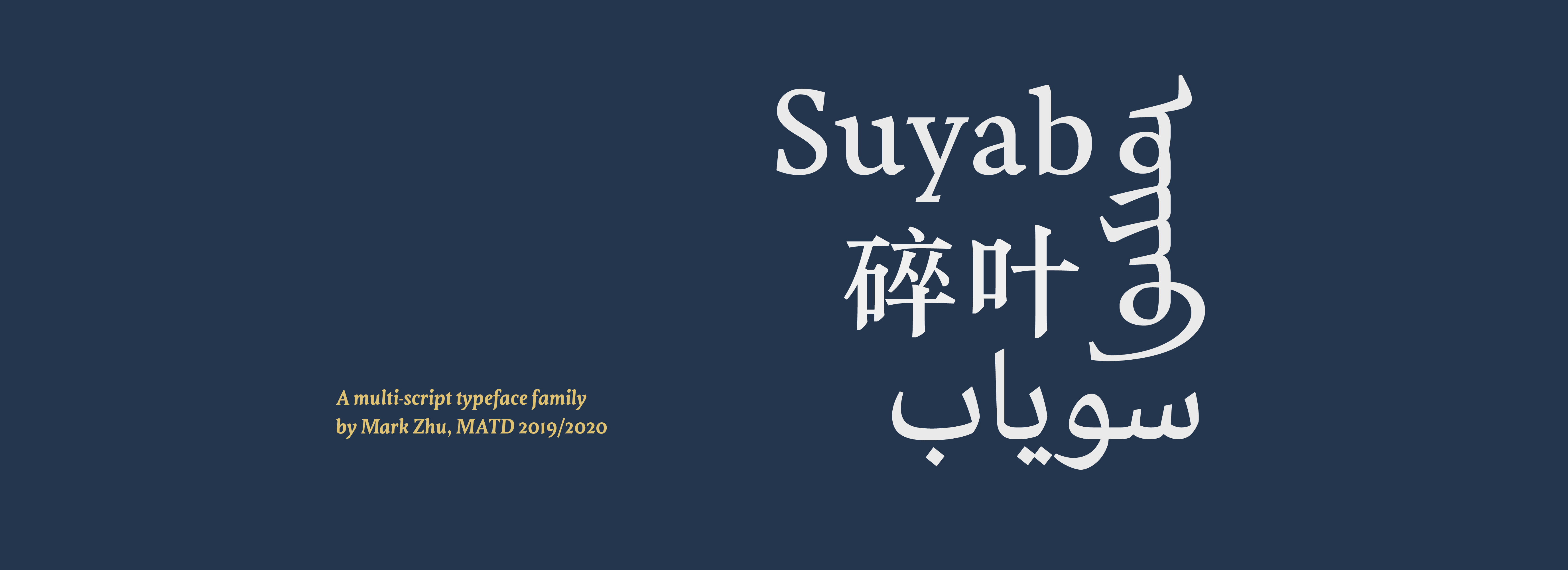
Suyab
Mark Zhu
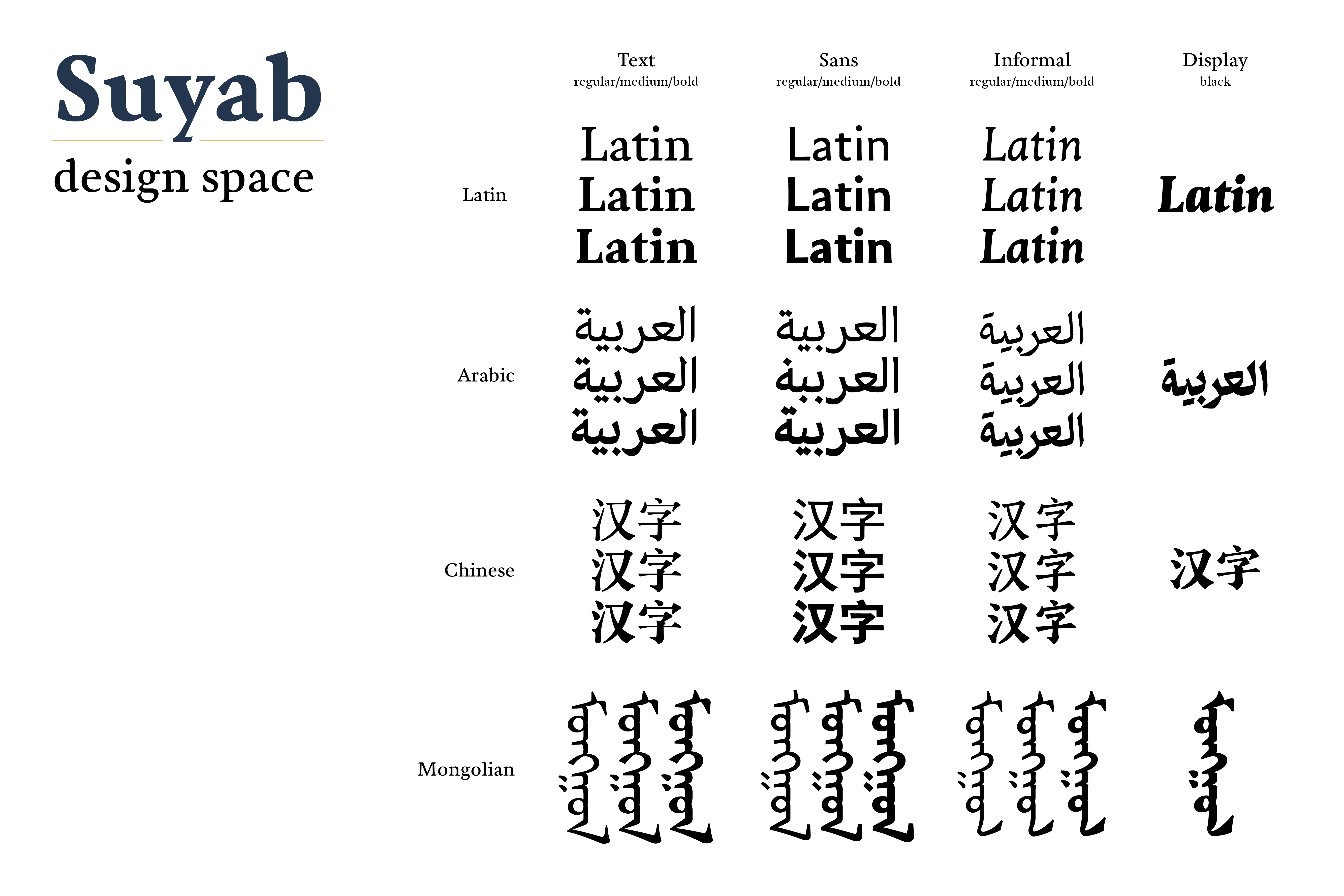
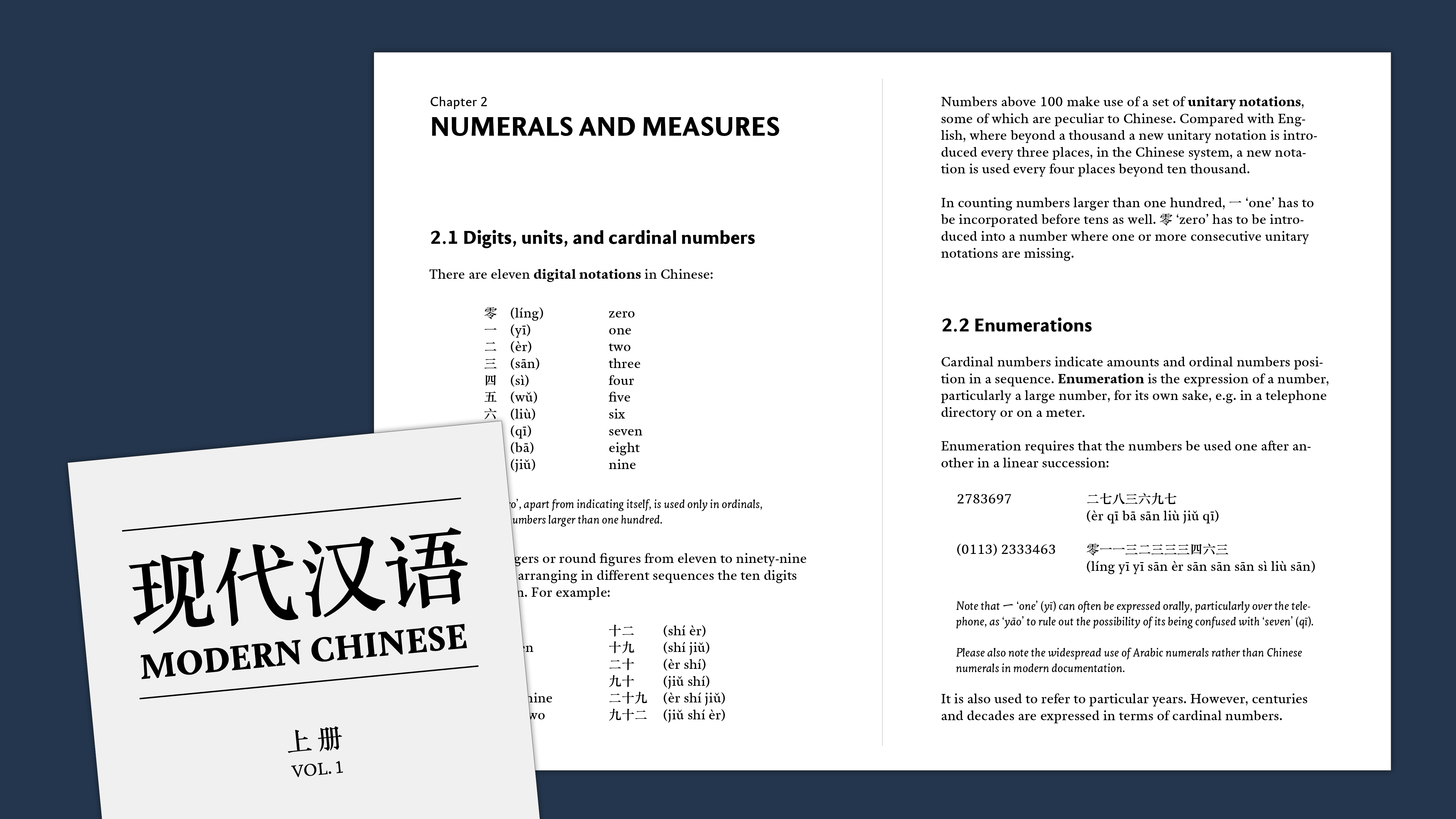
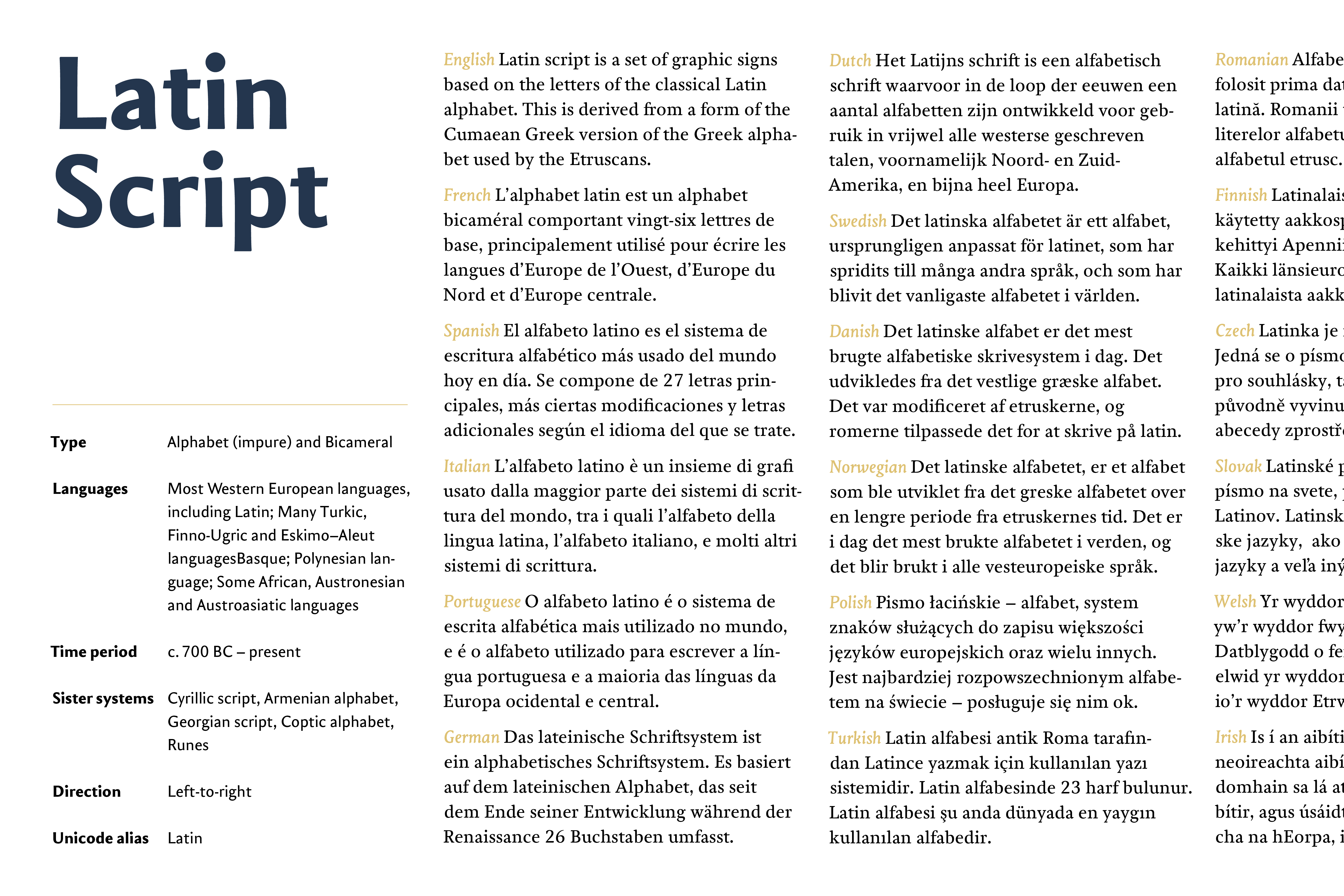
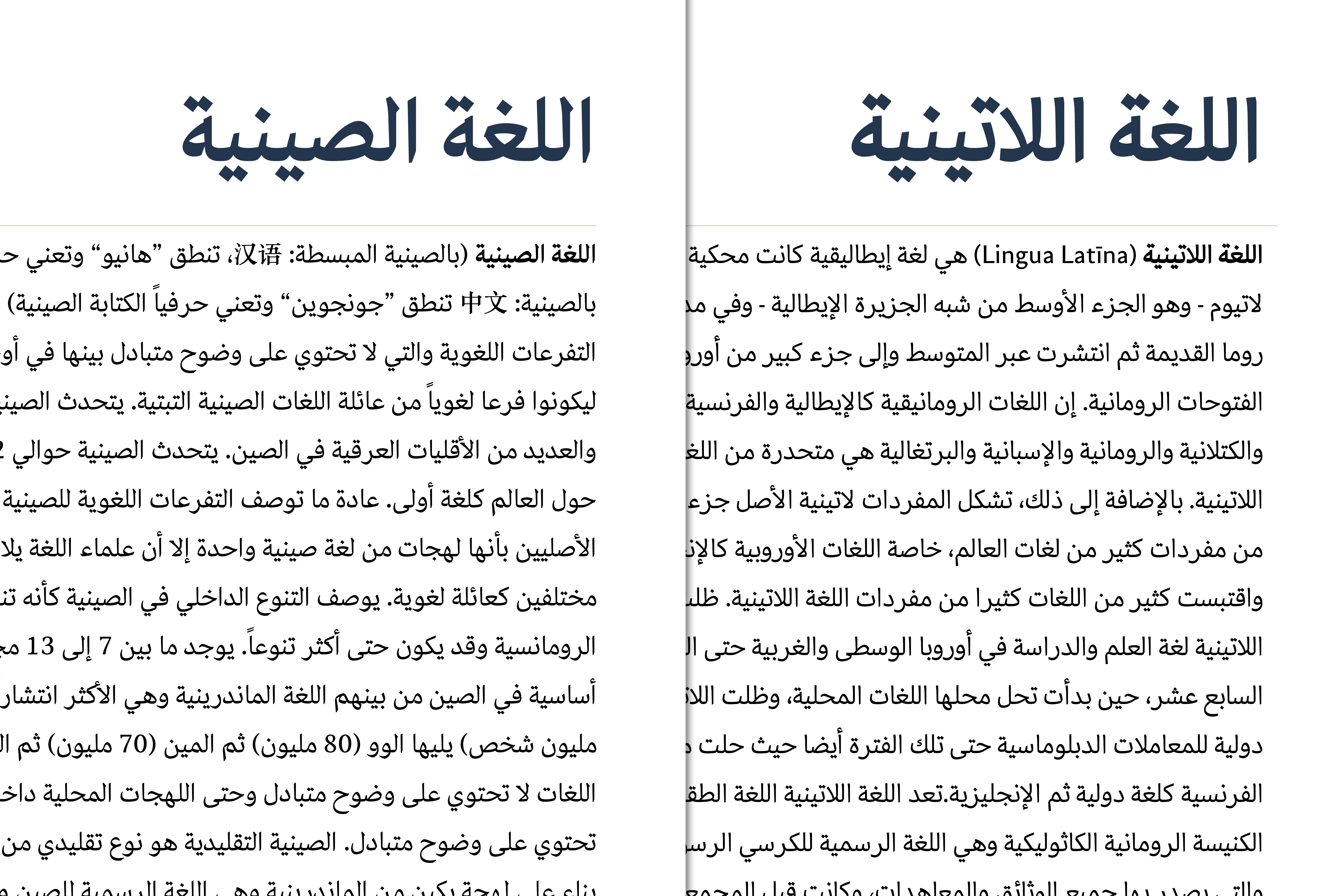
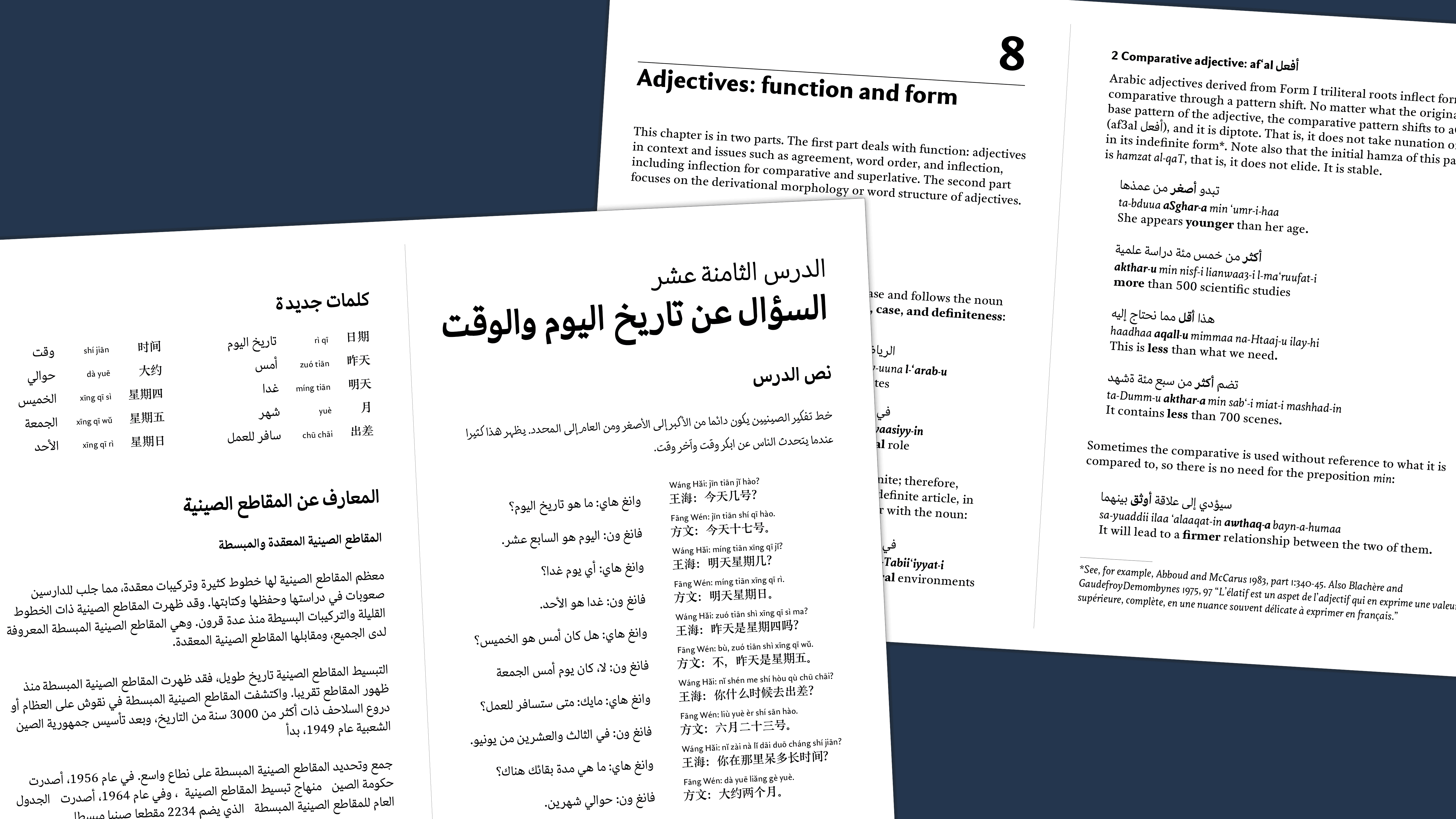
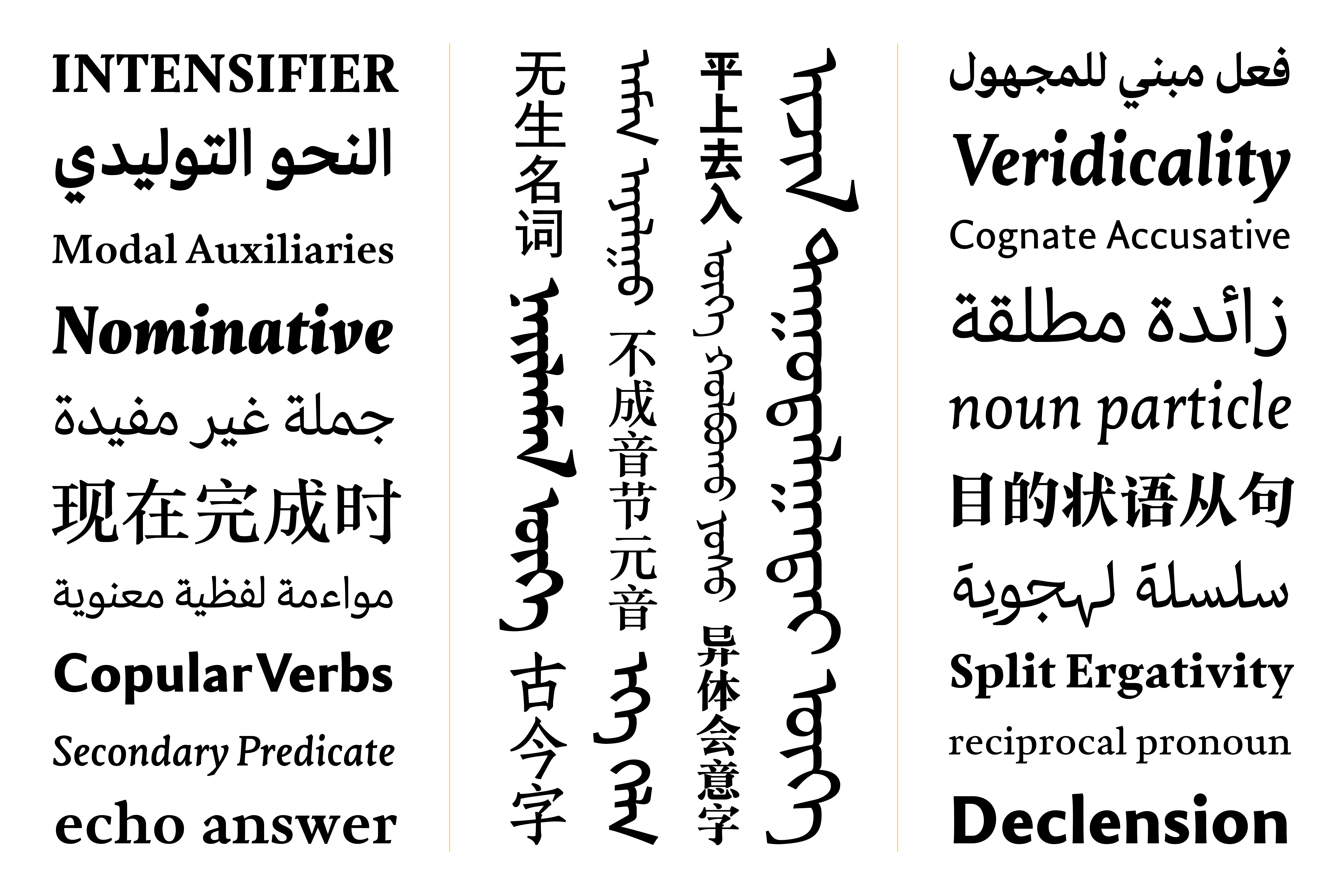
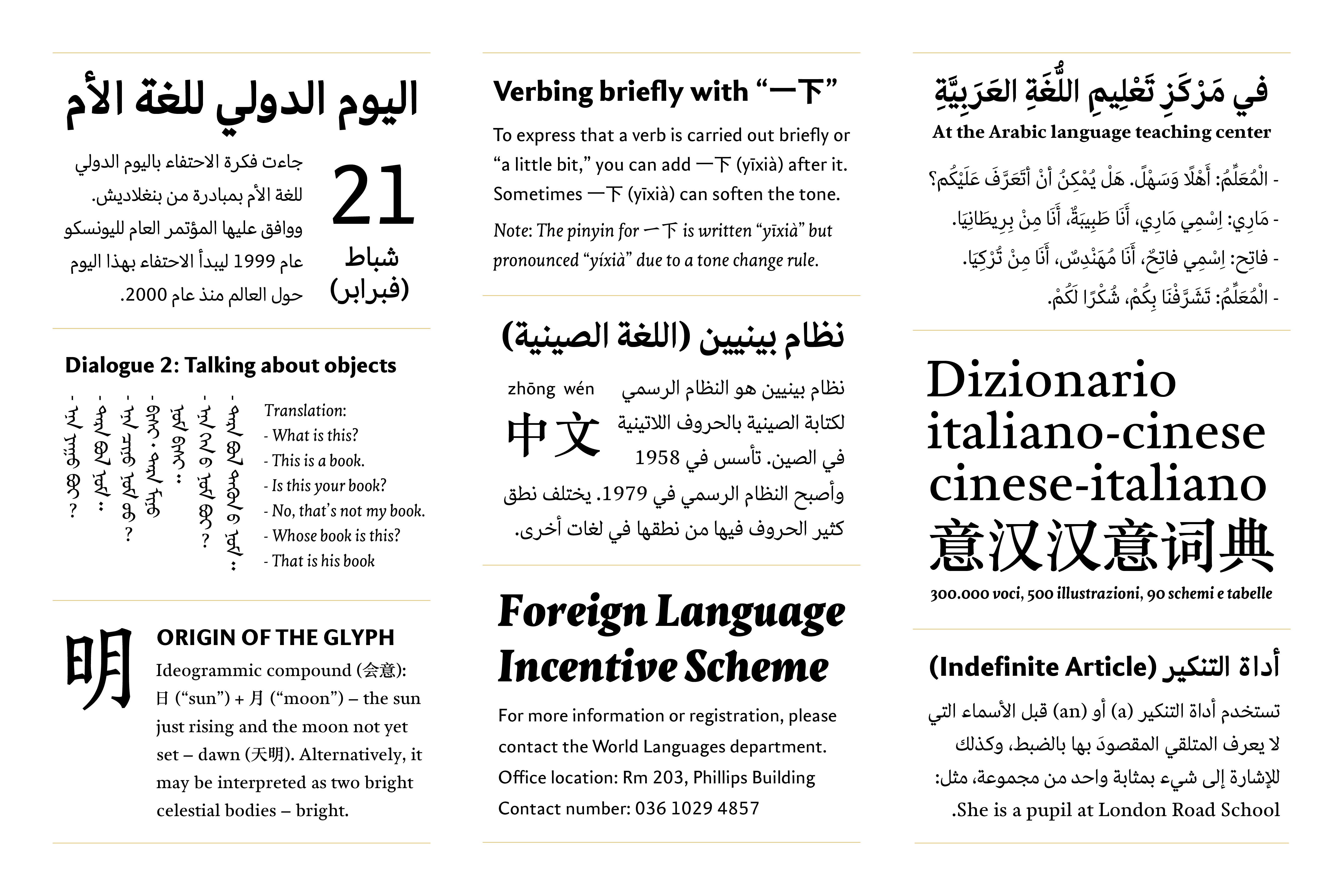
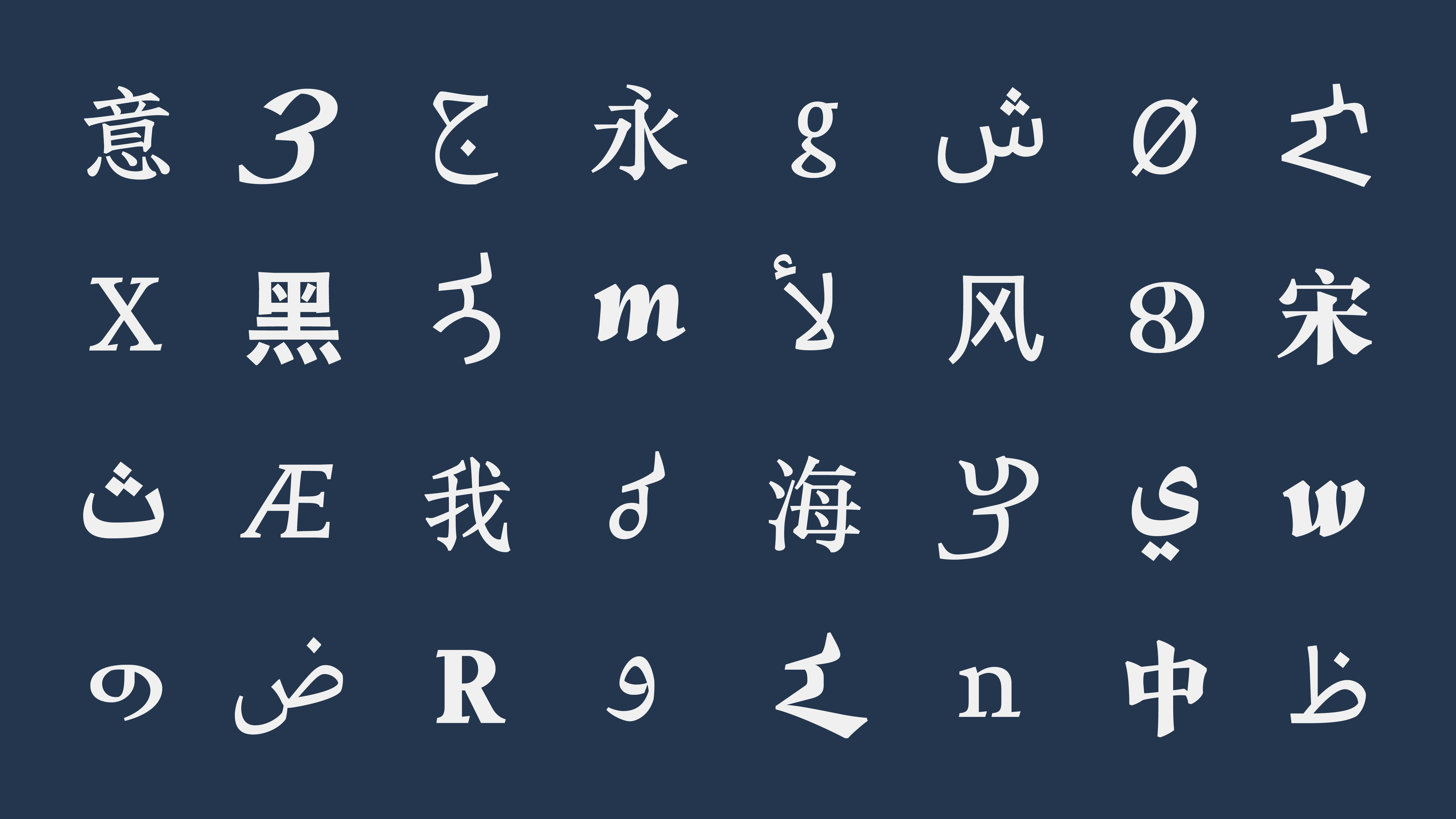
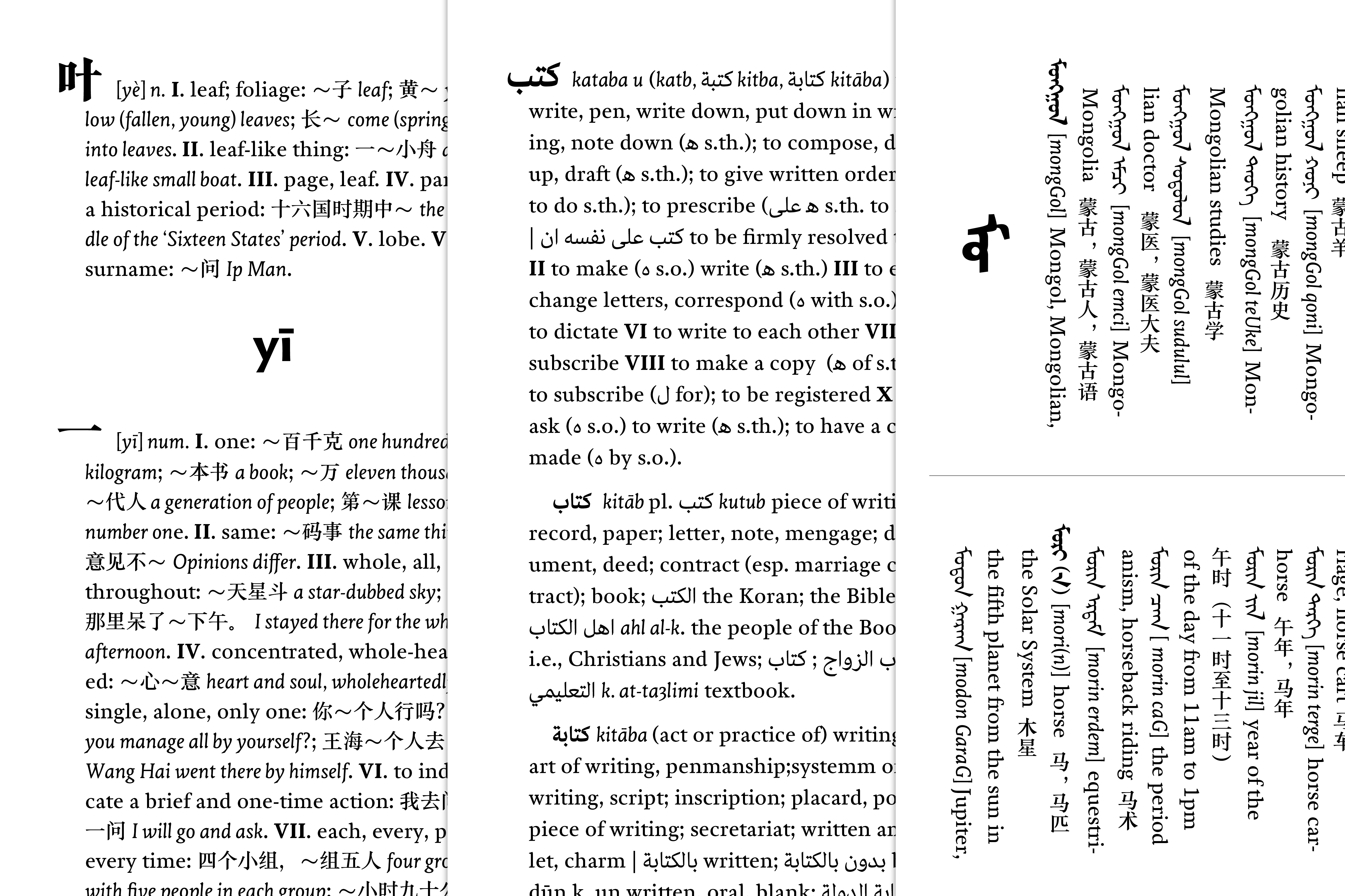
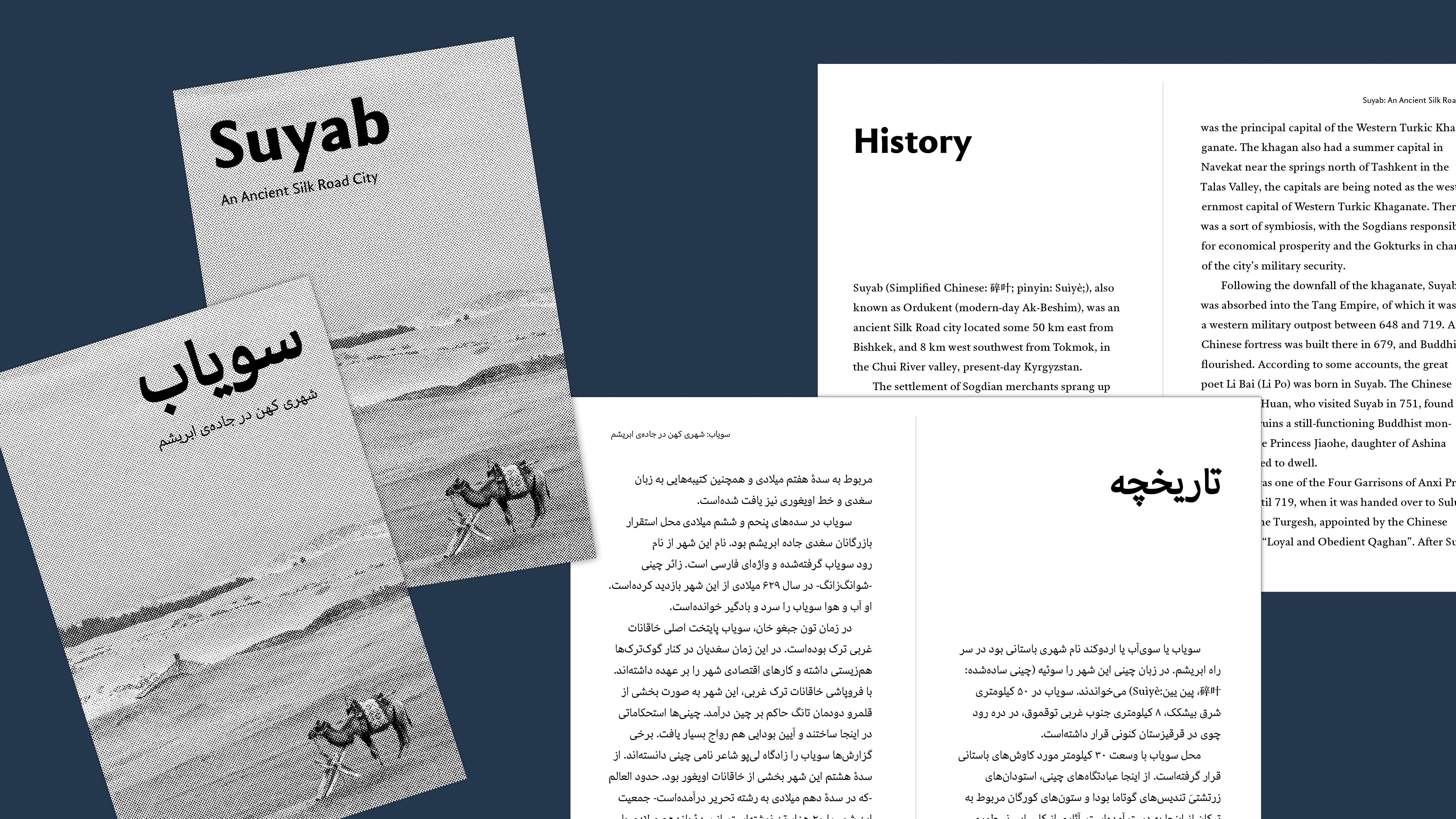
Suyab is a multi-script typeface family intended for language-learning textbooks and other complex multi-script typesetting environments, covering four scripts of various writing directions: Latin, Arabic, Chinese, and Mongolian. Each script includes three styles for text (Text, Sans & Informal) each in three weights, and one display style in black. The core idea of the family is to provide an equal variety of styles and weights in each script in order to support complex multi-script typesetting in any combination of them, while respecting and balancing the typographic tradition of each script.
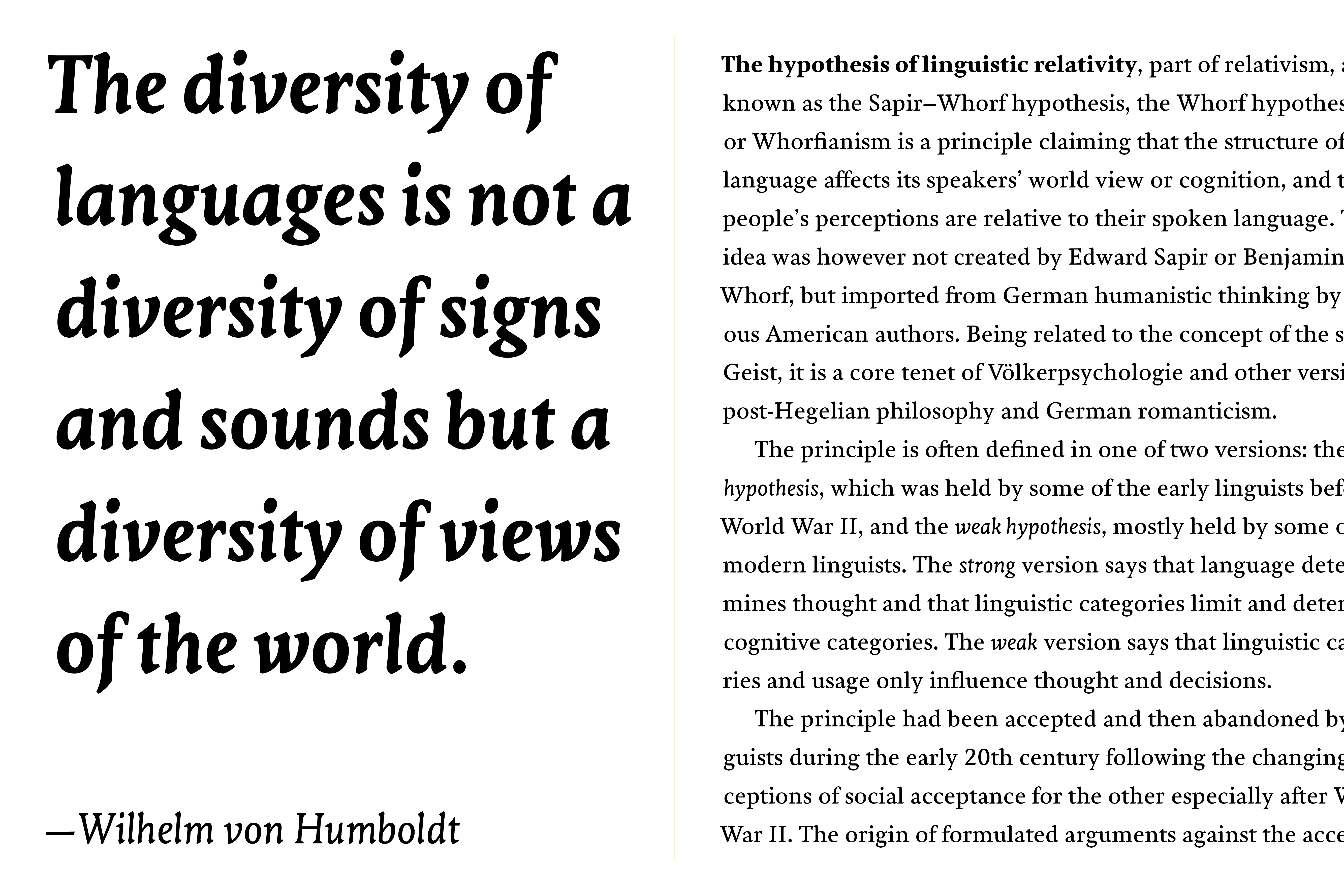
Since three of the four scripts do not have a tradition of secondary styles, Latin is designed to accommodate the others and not having a regular italic but an upright one. As a result, all the styles can be used independently to set long texts, but also be combined and used in various ways according to the typographic conventions of each script.
Mark Zhu
Mark Zhu is a Chinese designer currently based in the UK. He previously studied in the US, and his background and experience in design, calligraphy, and languages ultimately led him to the field of typeface design. He currently focuses on multi-script type design in Latin, Chinese, among other scripts.
Website
Email
Instagram
Q&A
Q: How did designing multiple scripts at the same within one project influence your workflow and/or design thinking?
A: Designing multiple scripts at the same time did present many challenges. I was constantly moving between scripts, and thinking how certain new design development made in one script would translate into another script. But on the other side, it also brought new sources of inspirations, as the scripts are all influencing each other within the family, leading to some ideas that I wouldn't have thought of if designing only one script at a time.
Looking back, I'd say many of the key design decisions in this project were made by thinking globally and looking at all the scripts at the same time. For example, while planning out the design space, I examined how different type styles are combined and used in each script, and one observation was that only Latin has the practice of always pairing a Roman with an Italic, while in the other scripts various type styles could be used independently, or combined in different ways depending on the situation. This eventually led to the decision to have three independent styles across all the scripts instead of any designated primary/secondary pairings, and that Latin was designed to accommodate the other scripts rather than the other way around.
Q: What is something you did (or you wish you had done/known) in preparation for the course that ended up being helpful during the development of the typeface?
A: I think getting myself familiar with some of the scripts, and thinking about what kind of project I wanted to do beforehand helped me decide on the scripts and a general direction early in the year. This allowed me to start the project with planning and designing multiple scripts at the same time, which turned out to be essential to the project.
Q: Aside from producing new typefaces, what are some other ways in which you hope to contribute to type design and the wider design community?
A: I hope to utilise my design and language skills to help connect people and communities from different cultures and backgrounds, and ultimately to promote and facilitate cross-cultural communication.
Q: Were you inspired by any particular writing tool or typographic style?
A: As this is a multi-script typeface, I was trying to mix and harmonise various influences from different scripts, while making sure all the scripts still stay faithful to their respective traditions.
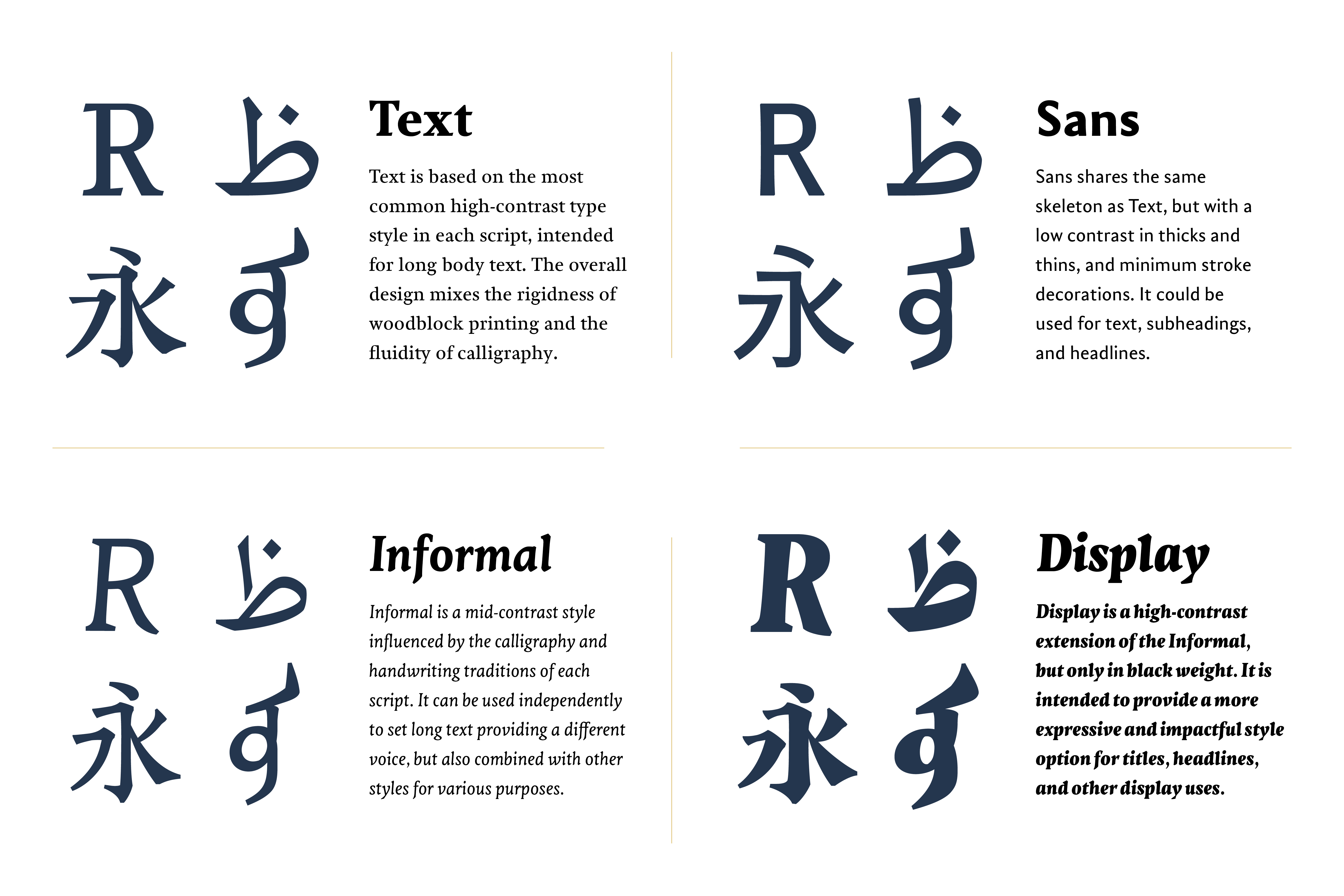
For example, for the Text style, the general direction is "a mixture of woodblock printing and calligraphy writing", because among the four scripts, Chinese and Mongolian are largely based on their woodblock printing character/letter forms, but on the other end Arabic is closely connected to its calligraphy tradition. Therefore, for Chinese and Mongolian, characters/letters from old woodblock printed books were the main inspirations, and some calligraphic features were then added to suggest pen movement; for Arabic the idea was to stay faithful to its Naskh structures, but also blending in design elements that give a woodblock impression; as for Latin, besides mixing the two influences, some blackletter influences were also introduced, because Latin's brief history with woodblock printing is mostly associated with blackletter.
On the other side, for the Informal style, the design influence mainly came from Chinese, which was then mixed with other scripts' own writing traditions. I identified some key elements of Chinese calligraphy, such as the use of a soft brush and a pattern of applying and releasing pressure while writing, and then re-imagined other scripts to be also written with a soft-tip pen and a pattern of applying pressure, to achieve a similar informal writing impression.
Colophon
And that’s a wrap! It’s been a pleasure to share the MATD19/20 final projects with you. We would like to send a big thank you to everyone who made this possible: Gerry, Fiona, Fred, Victor, Ewan, Borna, Vaibhav, Cheng, Bianca, Laurence, Frank and all the other lecturers for their time and feedback. Shoutout to coop, Park House, the coffee machine and the farmer’s market.
Typeface: Ohno Type’s Degular.
Team
Branding
John Mawby
Adriana Pérez Conesa
José Carratala
Jeremy Johnson
Content
Michaela Staton
Geneviève Cugnart
Development
Simon Thiefes
Eric Karnes
Radek Łukasiewicz
Team
PM
Keya Vadgama
Simon Thiefes
UI/UX
Keya Vadgama
Mark Zhu
Ryan Williamson