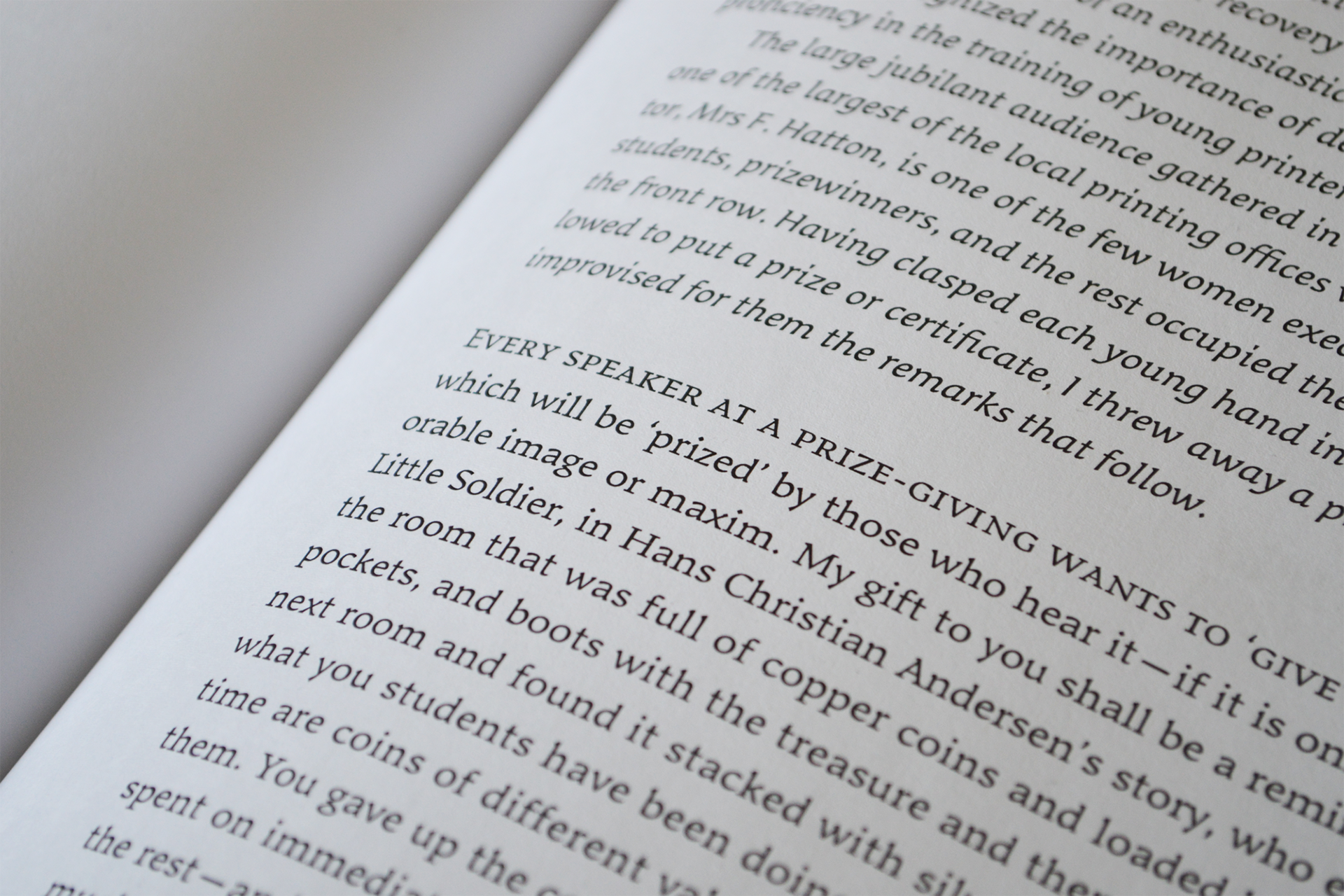
Bibliophile
John Mawby
A typeface inspired by people who love books, for people who love books.

Q&A
Q: Were you inspired by any particular writing tool or typographic style?
A: I was primarily inspired by the proprietary types of the private press movement during the beginning of the twentieth-century –most notably those with a curious roman-gothic form. As well as these types I was inspired by the illustration often featured in these private press books; the relationship in weight between text and image, and the mark-making techniques typical of wood-cut, lino-cut, and engraved illustration.
Q: What is something you wish you had done in preparation for the course that could have helped the development of your typeface?
A: A lack of Glyphs familiarity became a limiting factor, had I dedicated more time to familiarise myself with Glyphs prior to the course the typeface and workshops would have likely progressed smoother.
Colophon
And that’s a wrap! It’s been a pleasure to share the MATD19/20 final projects with you. We would like to send a big thank you to everyone who made this possible: Gerry, Fiona, Fred, Victor, Ewan, Borna, Vaibhav, Cheng, Bianca, Laurence, Frank and all the other lecturers for their time and feedback. Shoutout to coop, Park House, the coffee machine and the farmer’s market.
Typeface: Ohno Type’s Degular.
Team
Branding
John Mawby
Adriana Pérez Conesa
José Carratala
Jeremy Johnson
Content
Michaela Staton
Geneviève Cugnart
Development
Simon Thiefes
Eric Karnes
Radek Łukasiewicz
Team
PM
Keya Vadgama
Simon Thiefes
UI/UX
Keya Vadgama
Mark Zhu
Ryan Williamson