Subs n’ Stuff
Adriana Pérez Conesa
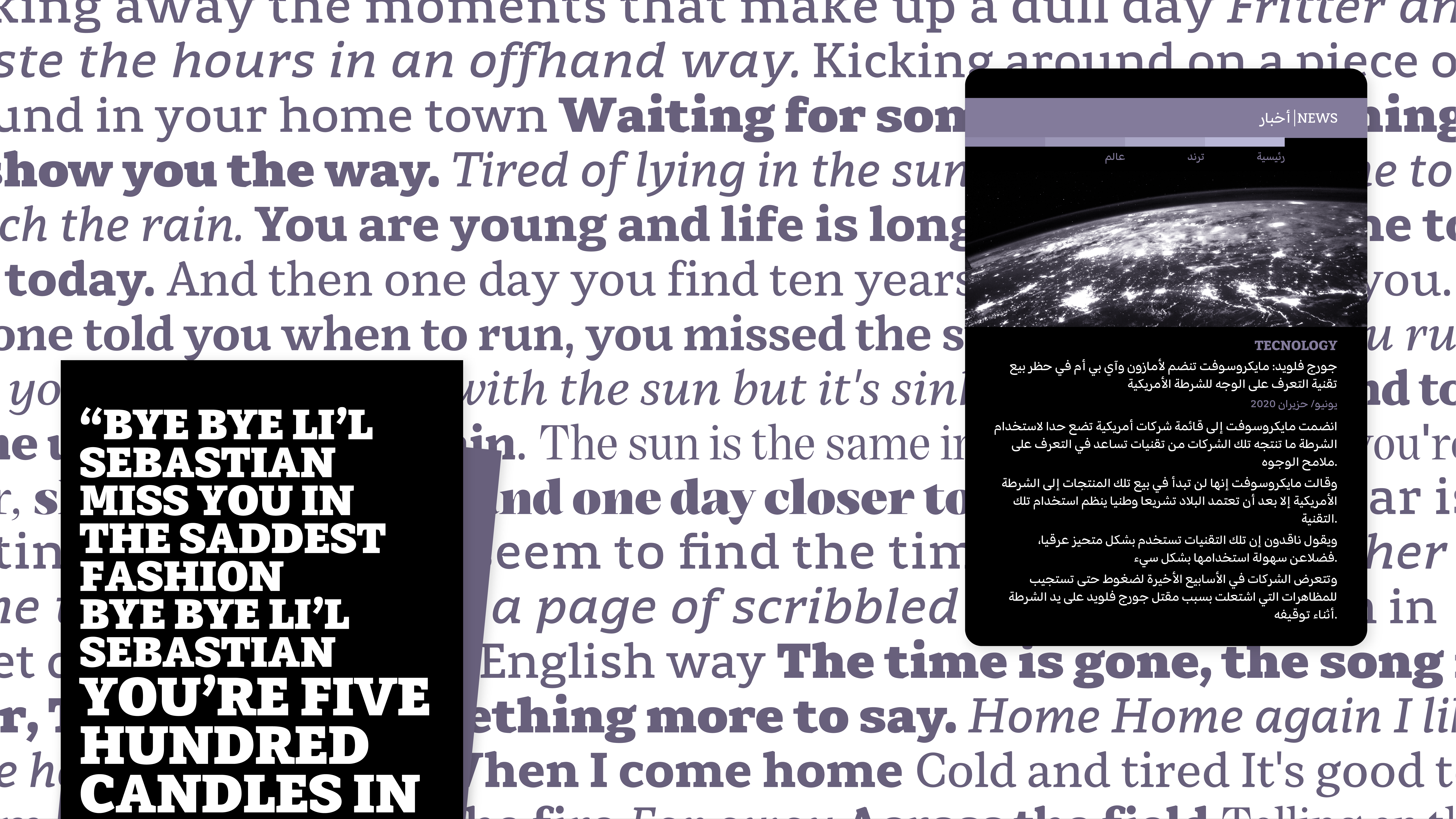
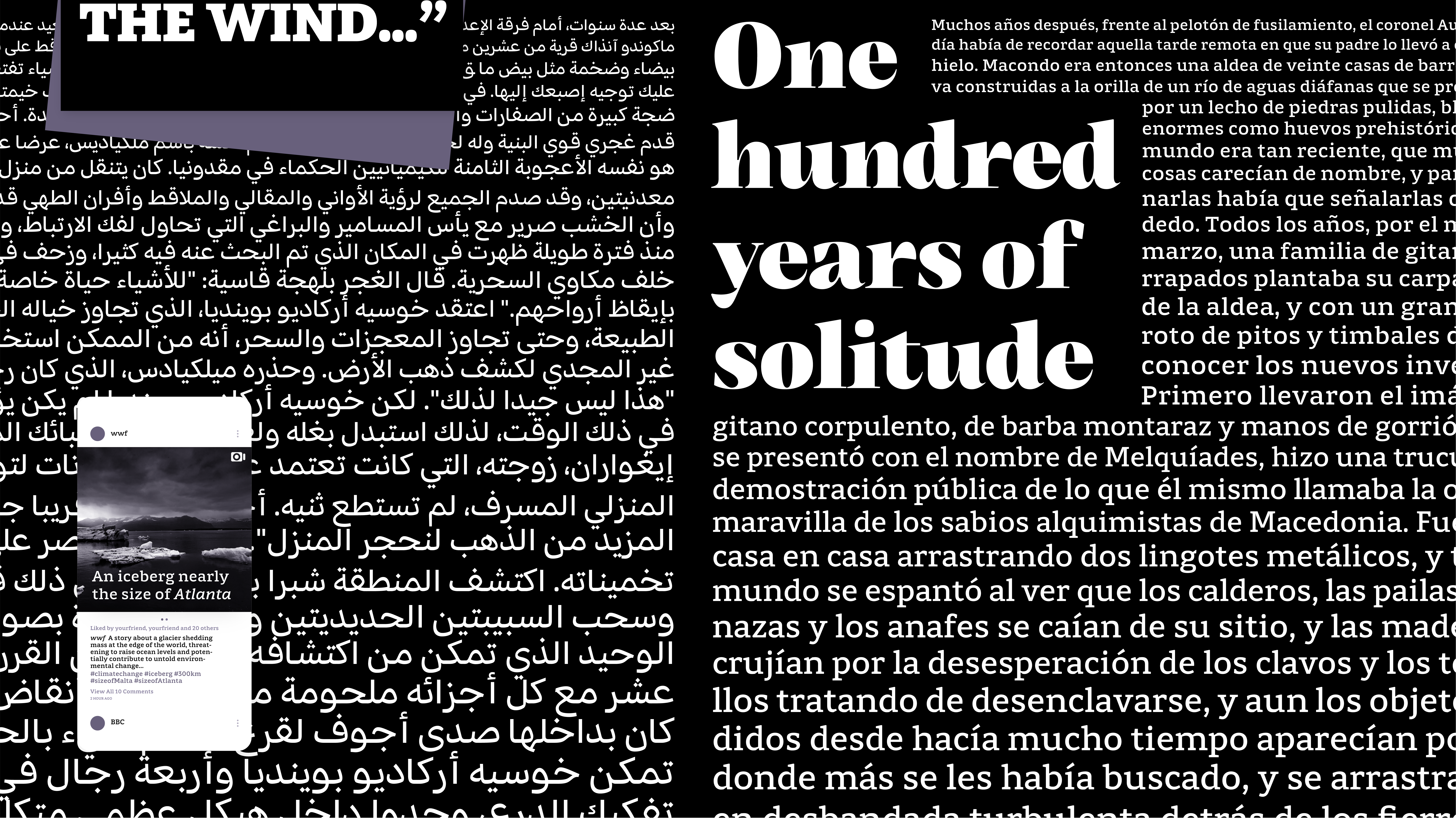
Subs n' Stuff is a versatile multi-script typeface family. It supports any medium in a high range of optical sizes, with a special coverage at small sizes but without forgetting about headings and bigger sizes.
The family is made up of two subfamilies: Subs uses squarish letterforms with low contrast and an increased x-height. This speeds up the recognition of letters because its intended use is on top of busy backgrounds as captions or subtitles. Its generous apertures, pixel-traps and clear shapes help reduce the chances of misrecognition, to help legibility.
Subs contains two different styles: Micro, intended for low-resolution screen and small sizes, and Text, for high-resolution screens and bigger sizes. Text is also variable in the weight axis. Stuff is a variable subfamily — that covers weight and optical size axes — that tones down the roughness and width of Subs. Its use extends from text sizes in long paragraphs in print or screen to display in short settings. Both subfamilies are accompanied by an italic style and support Latin and Arabic scripts.


Adriana Pérez Conesa
Adriana Pérez Conesa is a Spanish graphic designer, currently based in Barcelona. She studied art and graphic design at the University of the Basque Country where she discovered her passion in letterforms by exploring lettering, calligraphy and later on, type design. This led her to studying typeface design at the University of Reading. Adriana has yet to find her place in the typeface and graphic design industry.
Drop her an email to talk about Subs n’ Stuff, cool TV shows or to whine together about any situation :)
Also, you can see her work at her Behance!
Q&A
Q: What is something you wish you had done in preparation for the course that could have helped the development of your typeface?
A: Firstly, I would have learned how to code in Python, which would have made my life easier when developing my typeface. Nonetheless, I did not know before coming to Reading that programming could be something of interest to me. Secondly, I would have prepared myself more to receive such enormous amounts of information about typography. Typeface design is very complex and extensive, so it can be overwhelming to receive so much information in such a short time. Looking back, I would have prepared and read more, which would have allowed me to squeeze even more out of the Reading experience.
Q: How did designing multiple scripts at the same time within one project influence your workflow and/or design thinking?
A: Designing a multi-script typeface family makes you more aware of the structure of your typeface family and how its different members are connected. It made me question constantly what I was doing, so that the different scripts shared characteristics in a respectful and coherent way, without Latinising the Arabic script, which is a common mistake when the understanding of the writing system, its rules and history is overseen. Though it was tough to develop both scripts side by side, it helped me see the relationship between them (and between styles) much clearer.
Q: Aside from producing new typefaces, what are some other ways in which you hope to contribute to type design and the wider design community?
A: Before pursuing the MATD, I used to understand typeface design as a much more practical discipline, which was largely limited to the creation of vector files. Now I have a more global and wider vision about typography, in which many more aspects are involved, because it is an area of knowledge very connected with society and its evolution, with the change of times and the development of technologies. Now I am much more aware of the whole process of reflection, observation, research and evaluation behind typography. For this reason, though I still have no clue where my place is in the typeface or even in the graphic design industry, I hope to give back to the community in some way. It may be by sharing my knowledge with young graphic designers who might not be aware of the many possibilities typography can bring, or by coding and optimising, in a small scale, the design process, space or support of typefaces. Time will tell.
Colophon
And that’s a wrap! It’s been a pleasure to share the MATD19/20 final projects with you. We would like to send a big thank you to everyone who made this possible: Gerry, Fiona, Fred, Victor, Ewan, Borna, Vaibhav, Cheng, Bianca, Laurence, Frank and all the other lecturers for their time and feedback. Shoutout to coop, Park House, the coffee machine and the farmer’s market.
Typeface: Ohno Type’s Degular.
Team
Branding
John Mawby
Adriana Pérez Conesa
José Carratala
Jeremy Johnson
Content
Michaela Staton
Geneviève Cugnart
Development
Simon Thiefes
Eric Karnes
Radek Łukasiewicz
Team
PM
Keya Vadgama
Simon Thiefes
UI/UX
Keya Vadgama
Mark Zhu
Ryan Williamson